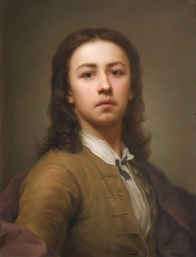
My friend (and past research colleague), Frances Bell, is attending an online free motion building quilting course run by The Crafty Nomad. I have been enjoying watching her progress as she posts images of her practise samples to her Flickr site, and rather envying her skills. Frances has already made some beautiful quilts so it was interesting to read her explanation of why she is doing this course:
What I am hoping to learn from this course is more about constructing a design – putting together different elements into an overall design. The project that I’ll do in a couple of weeks will have 12 coloured rectangles separated by white space so that’s plenty of opportunity for experimentation.
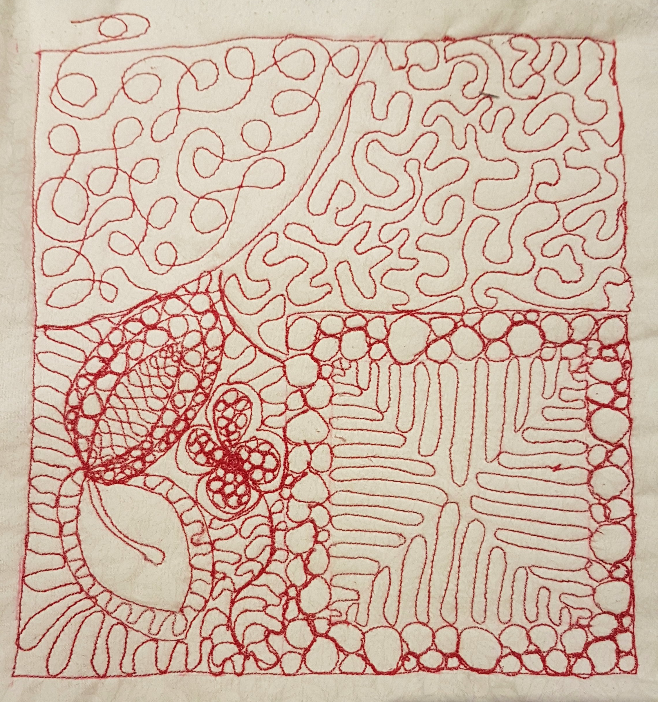
The image above was the first photo that I noticed. I really liked the trailing thread in the top left hand corner, which I saw as ‘breaking the boundary’, an idea that for some reason appealed to me. Frances explained ‘the stitching that breaks the boundary was where I started’, which of course made sense (you have to start somewhere), but I still prefer to think of it as breaking the boundary! Frances went on to explain that ,
… we are encouraged to have a high contrast between the thread and fabric colours. This is so that the “mistakes” stand out so we can work on avoiding them. Then in the projects we will choose a thread that blends with the fabric to make any mistakes recede. I think there’s a powerful message in there for learning/education in general. There’s a lot of controversy about “safe spaces” but I do like the idea of an educational space where learners are comfortable to acknowledge what they will do differently next time.
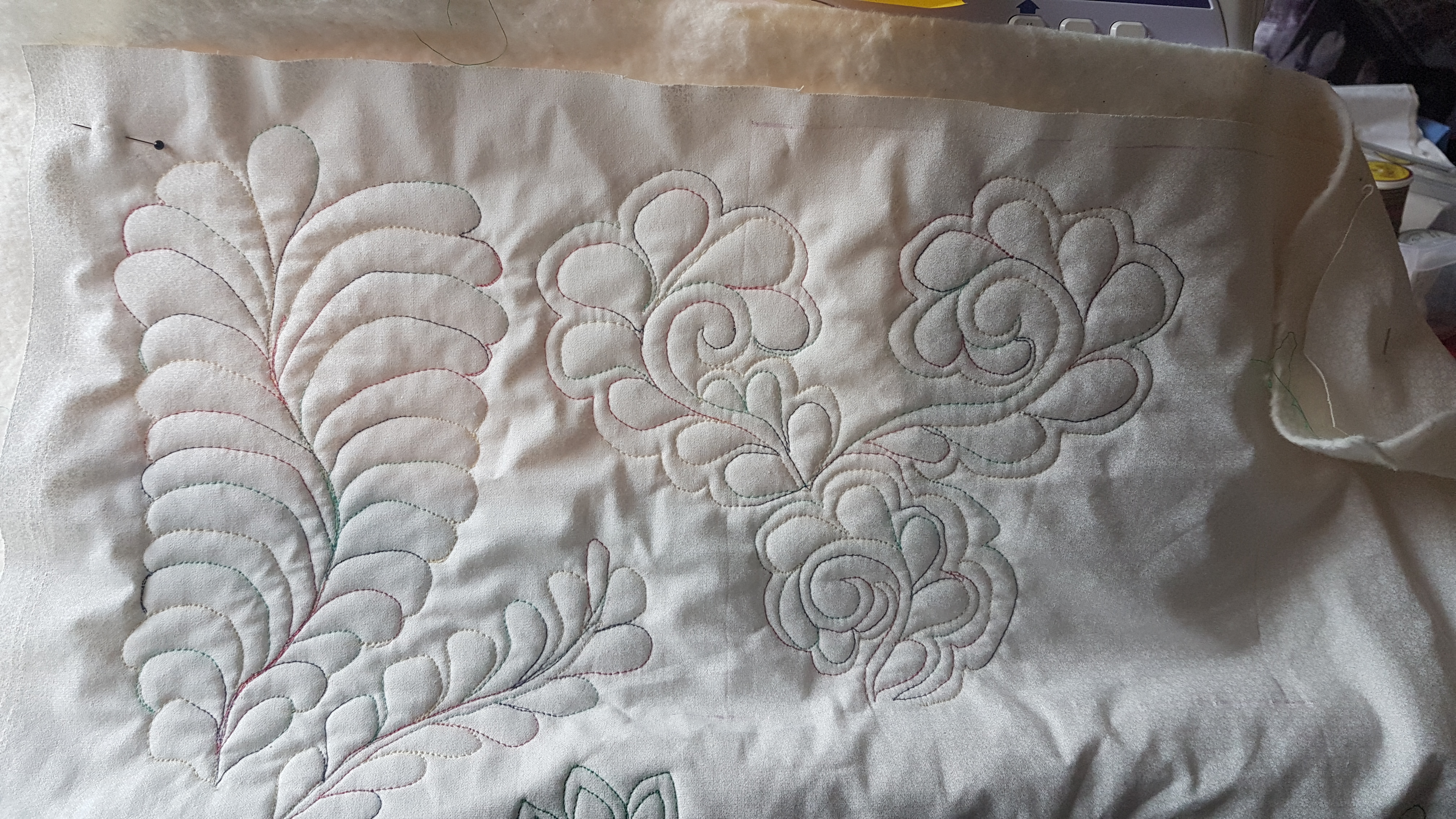
This idea of making mistakes stand out is further developed by Frances in another practise sample that I really like.
My reaction to this sample was: This is lovely. I like the different coloured stitching on the white background – very subtle and delicate, and once again Frances responded that this is a technique used to highlight errors:
I love variegated threads – they tend to distract from errors. I have chosen a different contrast thread for each module specifically to highlight errors while learning on practice pieces.
Quite by chance, at the same time as having this exchange with Frances I have come across the idea of ‘the imperfect stitch’, or ‘Persian flaw’, which is a deliberate error in an otherwise perfect work of art. The errors are not intended to detract from the beauty of the work of art (which could be a rug, a piece of embroidery, a quilt, or a piece of pottery), but rather to be subtly introduced (so subtly that the imperfection might be difficult to detect), to signify the inherent humanity and imperfection of the artist.
‘A Persian rug is perfectly imperfect, and precisely imprecise’.
In the eyes of the Persian rug makers and in other cultures of rug makers, such as the Navajo rug weavers, ‘Only God is perfect’. Flaws are an integral part of being human. Similarly, according to Iain McGilchrist, in Chinese architecture, the last three tiles are always left off the roof. The first great Chinese historian, Ssu-ma Ch’ien, records:
Even heaven is not complete; that is why when people are building a house they leave off the last three tiles, to correspond. And all things that are under the sky have degrees. It is precisely because creatures are incomplete that they are living .
(Ssu-ma Ch’ien’ quoted in The Matter With Things (TMWT) by Iain McGilchrist , p.840)
When I first came across the photos of Frances’ work which I like so much, I hadn’t read Iain McGilchrist’s chapter on The Coincidence of Opposites (Chapter 20) in his new book, The Matter With Things. Our Brains, Our Delusions, and the Unmaking of the World. In this chapter Iain writes about the importance of asymmetry. Here are a few quotes from the chapter:
‘There is also a necessity for slight imperfections in DNA transcription for there to be change and creativity: evolution.’ (p. 840, TMWT)
‘Sameness is indeed sterile, and cannot give rise to anything.’ (p. 840, TMWT)
‘Balance needs to be constantly disturbed and restored. Symmetry breaking is everywhere in living organisms.’ (p.840, TMWT)
I realise now that this is why I was drawn to Frances’ practise samples with their errors, which I find so attractive. They include an asymmetry which is a beautiful expression of the combination of sameness and difference, order and disorder (TMWT, p.839). For me, the art of deliberate imperfection seems one worth pursuing, and one which helps to ensure the uniqueness of the art. I wonder what Frances’ tutor would make of this idea, and indeed Frances herself?
This is the first module of The National Gallery’s Stories of Art Online course. The course consists of seven modules, each lasting six weeks (and thus the course runs for a year from September to August), starting with the art of the 13th and 14th centuries, and ending with 20th and 21st century art.
I have already completed modules 2 to 7 (search under the category Art History, or the tag National Gallery on this blog for previous posts), but I missed this first module, not having been aware of it at the time, hence working on it now. It is quite a jump to go from 21st century art and, for example, the work of street artists such as Banksy, back to the 13th century and the work of Giotto.
Module 1 is being presented by Siân Walters, who is not a new face to me, since she helped out on many of the other modules by working in the background to answer participants’ questions.
Week 1: Overview
Week 1 of Module 1 started with an overview of the period. This was the introductory text provided by Siân Walters in the handout.
During the High Middle Ages, many cities in Italy began to assert their autonomy and new models of government evolved. Increased urbanisation led to a rise in art patronage: vast cathedrals were built to accommodate increasing populations and large numbers of works of art were commissioned for the decoration of churches, as well as for private devotion. In this session we will look at the context in which art patronage evolved with reference to the emergence of the mendicant orders, notably the Franciscans. We will also consider the predominant Byzantine style of the 1200s and early 1300s and the influence of non-Western culture on Marian iconography, such as the cult of the Black Madonna.
I am not going to write about this overview, but instead focus on what was most interesting for me in this week, which was the recognition that art history did not start with the Renaissance, but that the Renaissance was influenced by the art that preceded it. Particularly interesting for me was how influential was the work of Giotto, who changed the course of art history and has been called ‘The Father of Western painting’.
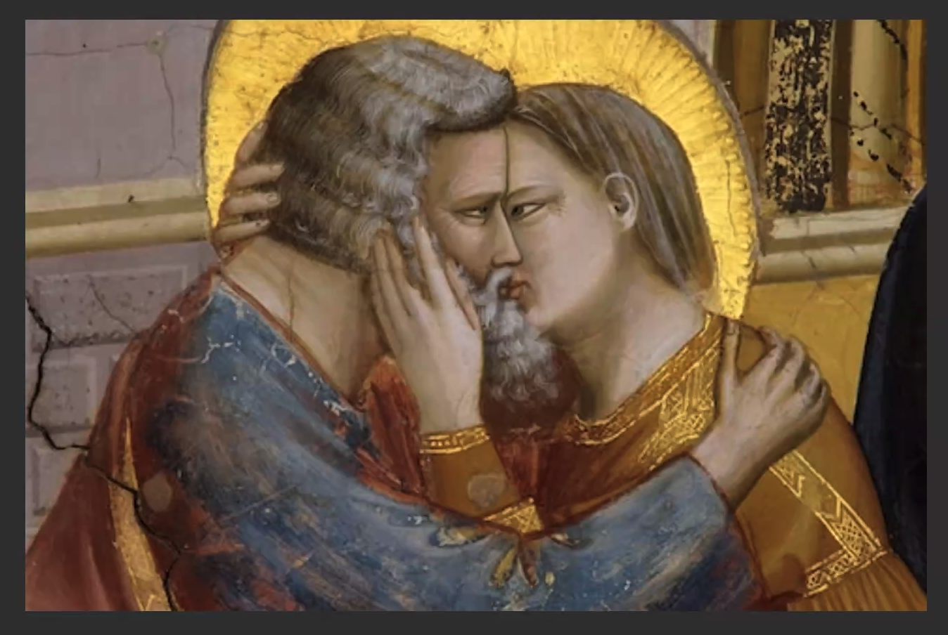
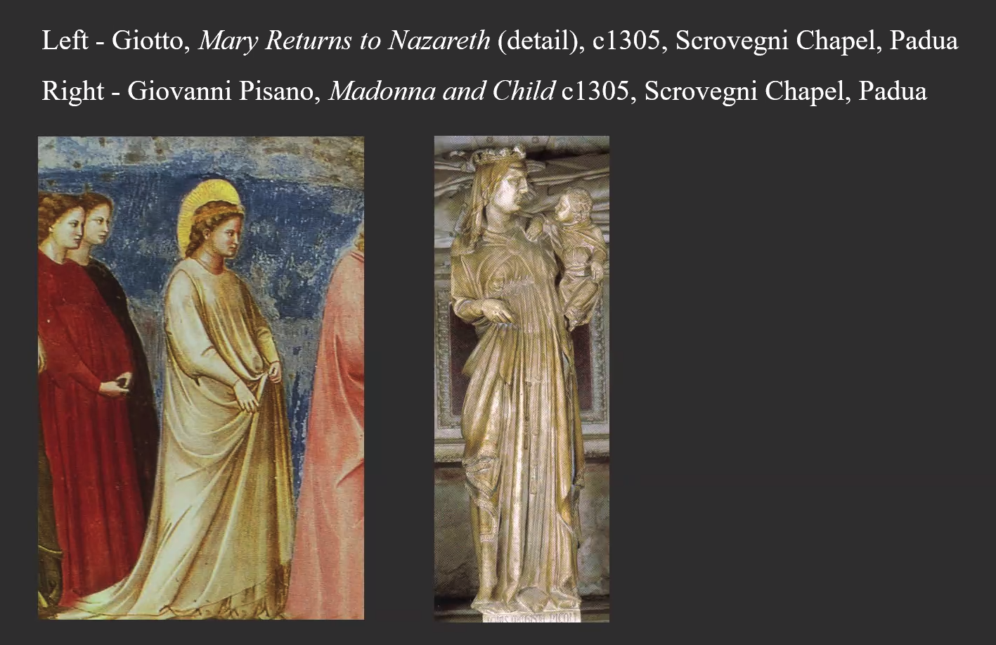
Giotto’s influence in this period cannot be overestimated. He was brought up under the influence of Byzantine art, but unlike the flat, iconic, stylized painting of that tradition, Giotto’s work was realistic and three dimensional. His incredibly expressive paintings were an absolute revelation in terms of his approach to narrative and execution. No-one had seen work that was so realistic and tangible in the early 1300s. Giotto was a wonderful storyteller and a great innovation was his emphasis on human emotion.
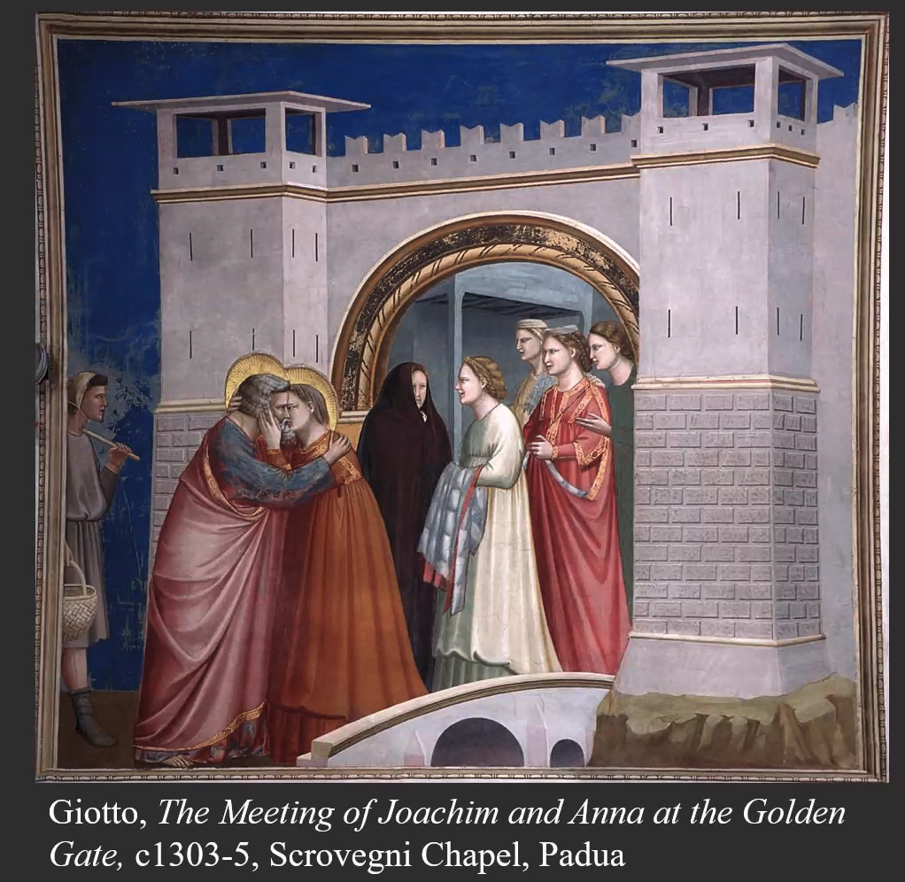
Giotto was the first artist since Roman times to employ perspective in the way he did, and he was the first artist to use a cropping device (see the cropped figure on the left in his painting of The Meeting of Joachim and Anna at the Golden Gate). Siân Walters also suggested that Giotto drew some inspiration from sculpture and the way folds in clothing was depicted in sculpture. This was a common way of working 100 years later in the 1400s, but not in the time of Giotto.
There was of course a lot, lot more in this first week of the course than I am covering here, and many, many more slides. We considered key forms of patronage in this period, looked at the historical, social, and political background in Italy at this time, considered how sacred and secular artworks functioned in different ways, and examined how painting developed stylistically from early works under Byzantine influence to later paintings by Giotto. I have focussed on Giotto, who was a revelation to the art world of the 13th century, but also a revelation to me in the 21st century.
Week 2: Artist in Focus: Duccio
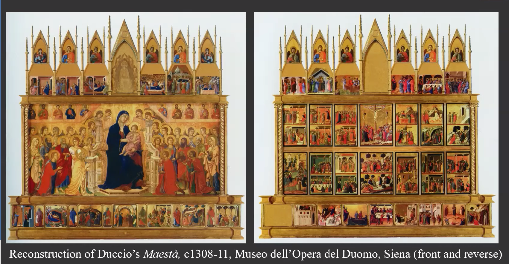
The 1300s was the Golden Age of Sienese painting. Its leading artist Duccio di Buoninsegna was one of the most innovative and influential figures in Western art, introducing a new naturalism and interest in space, structure and emotion which would bridge the gap between the Byzantine idiom and a new, modern style. In 1311, he completed the city’s most famous altarpiece, the Maestà, for Siena Cathedral and a number of its panels can now be found in the National Gallery. (Text from the course handout)
The Maestà is a very large work, 7ft x 13ft, which Duccio, according to the terms of his contract was expected to work on alone, although Siân Walters thought this must have been impossible. It was a huge undertaking, not only in terms of its size (it consists of 59 panels), but also because it was painted on the front (for the congregation) and the back (for the clergy).
Duccio was working at the same time as Giotto, but Giotto became more famous, perhaps because Giotto worked in Florence and Duccio in Siena, and also perhaps because Giorgio Vasari, a 16th century art historian best known for his ‘Lives of the Most Excellent Painters, Sculptors, and Architects’, mistakenly attributed some of Duccio’s work to his teacher Cimabue. There is not a lot of documentary evidence of Duccio’s life, but from surviving documents we know that he was a headstrong individual, who at times was in trouble with the law.
Despite not being as famous as Giotto, Duccio was famous in Siena and was paid 3000 gold coins for Maestà, which was an astronomical sum at the time.
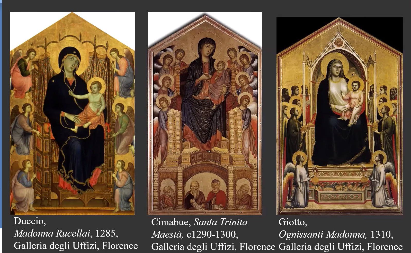
Both Duccio and Giotto brought a more human approach to painting. Their style was more realistic than other painters of their time, as can be seen from the comparison of their work with that of Cimabue in the image above.
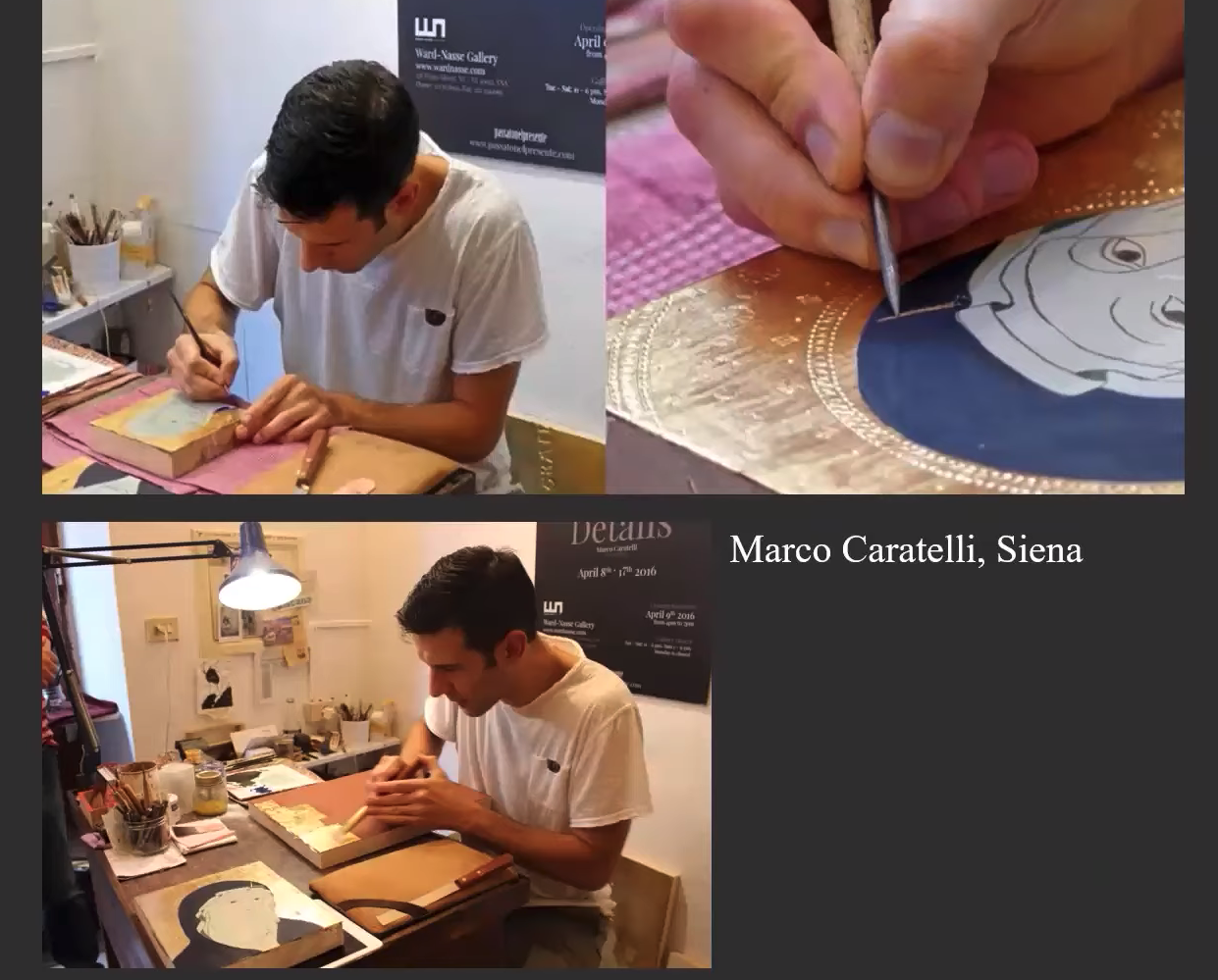
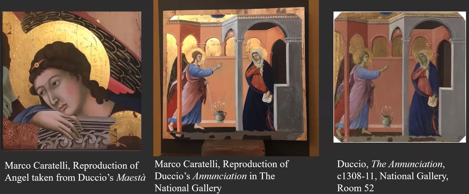
The work of Duccio and Giotto, as can be seen from the images posted, made extensive use of gold leaf. In the second half of this week’s session we were taken on a private, virtual visit to the art studio of Marco Caratelli in Siena, who showed us how he replicates the work of the great Sienese masters, such as Duccio, and the techniques he uses including the application of gold leaf.
Marco’s ‘bible’ is Cennino Cennini’s ‘The Craftsman’s Handbook’, published over 600 years ago, which describes how artists of the time applied gold leaf. The book can still be bought online. This short video gives you a flavour of what we saw https://youtu.be/PTbBCjCv3vg which was fascinating. Such patience is needed!
Week 3: Symbols
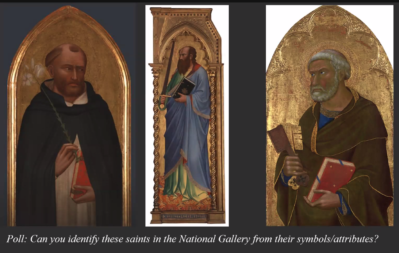
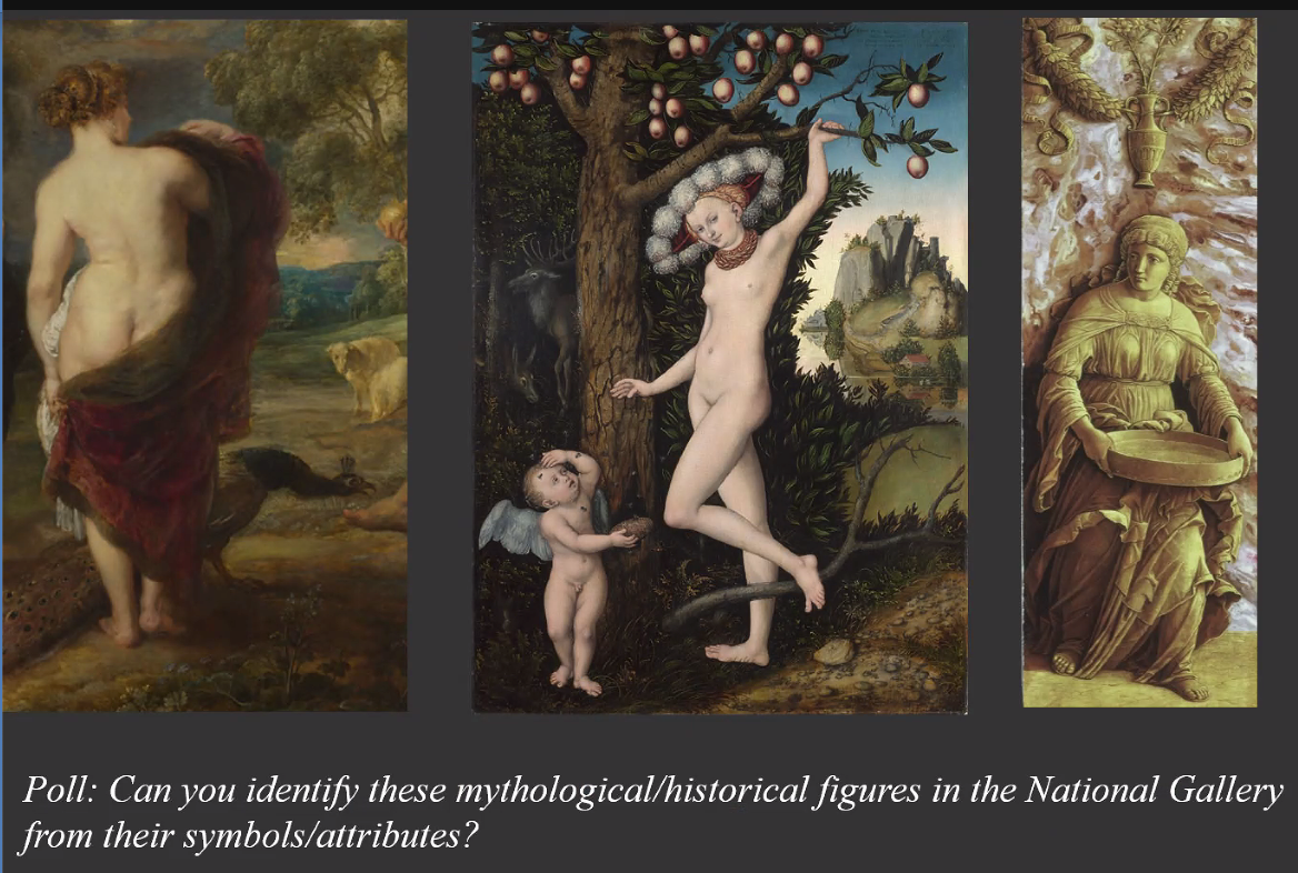
The key question this week was ‘How can we decipher a painting through its symbols?’ The focus was on iconography and the language of symbols in the 13th and 14th centuries. Iconography is essential to the study of the history of art and the language of symbols changes over time, but in the 13th and 14th centuries, when illiteracy rates were high, paintings were made to speak to the people and the use of symbolism meant that they could be more easily understood. For example, a dove in a painting represents the Holy Spirit, a lily represents purity and chastity, and the halo is a symbol of holiness. Colours were also used as symbols; gold represents divinity and purple represents royalty. Figures in paintings can often be identified by the colour of their clothing; the Virgin Mary is often painted in blue and read, St. Peter in blue and gold. Siân Walters devised a number of polls for this session. Here are screenshots of two of them.
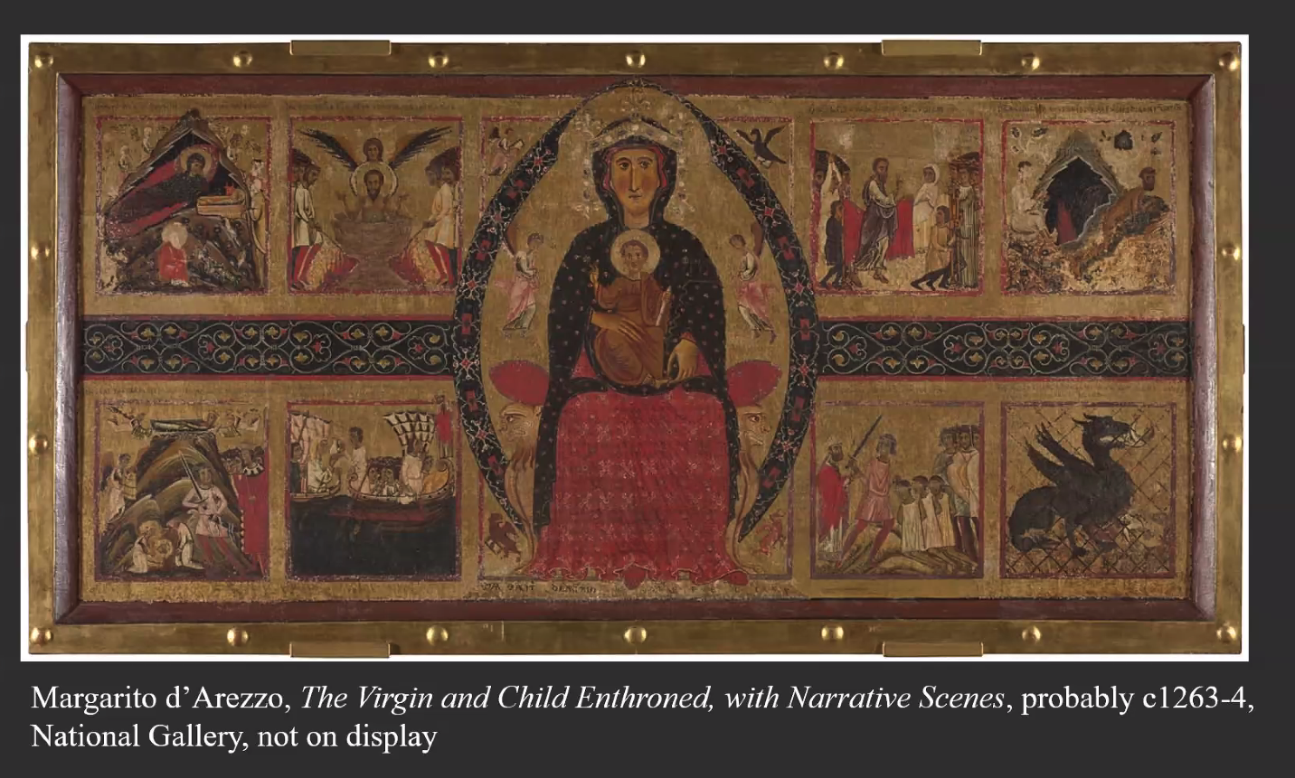
As well as being shown a number of slides of paintings which include symbols, quite a bit of time was spent looking closely at Margarito d’Arezzo’s painting, The Virgin and Child Enthroned, which is full of symbolism and narrative. Note the mandorla (the almond shape enclosing the Virgin Mary) which symbolises eternity. This is one of the very few signed paintings of the era. Margarito was a prolific and very important artist in the 13th century who drew on sculpture and byzantine painting for inspiration and was a wonderful storyteller. Painted around 1263, this is the oldest picture in the National Gallery’s collection.
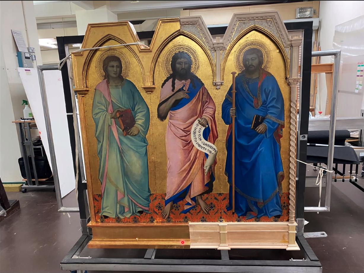
In the second hour of Week 3, Peter Schade, Head of Framing at the National Gallery introduced us to the stylistic evolution and the development of the frames of the National Gallery’s paintings. He described how he sources, creates, and adapts examples which complement the paintings historically. Here is an example of a frame he is working on. Nardo di Cione, Three Saints – about 1363-65
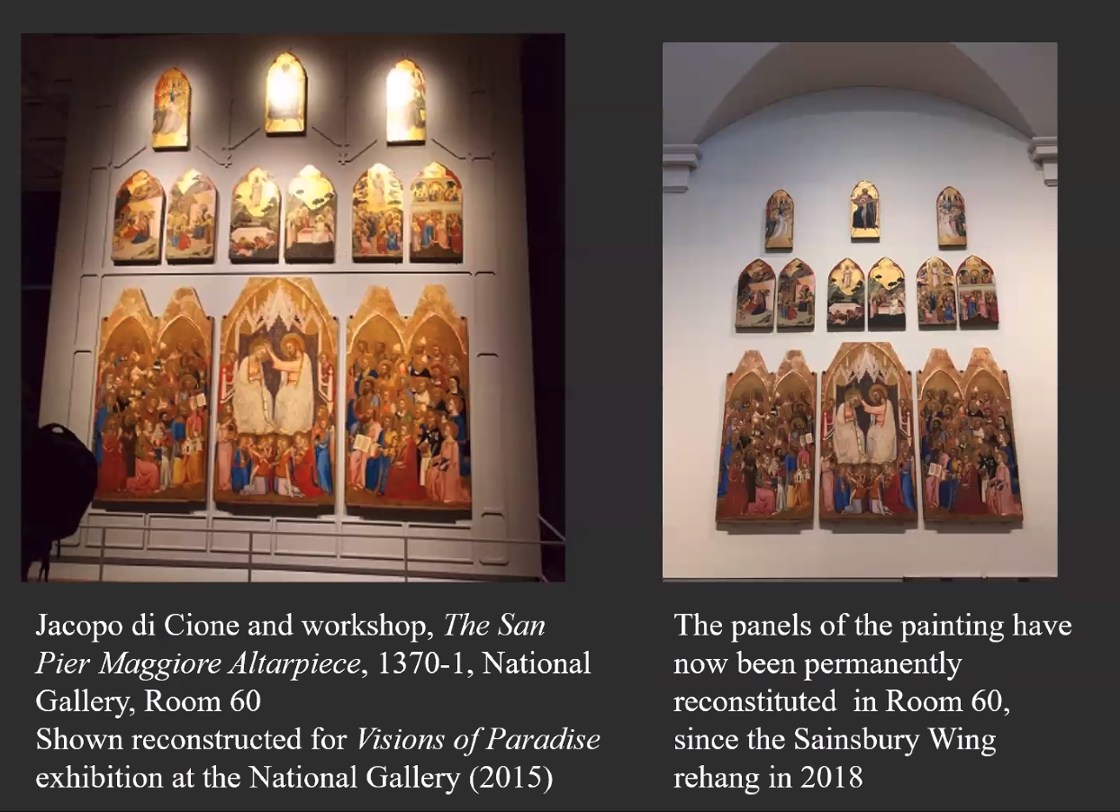
This week the question raised was ‘How do paintings function differently in museums from their original locations?’ ‘Most of the works commissioned during the Medieval and early Renaissance period were designed for worship and yet very few of them remain in their original location, calling into question how we can interpret and view these works in a museum context’ (text from Siân Walters’ handout). Many of the works of this period were designed to be seen in dark churches and lit by candlelight. They were also designed as altar pieces to be hung high up, so that the view of them could not be obscured. If the centre of the painting was going to be obscured by a large cross on the altar, then that section of the painting included very little detail and no content of importance.
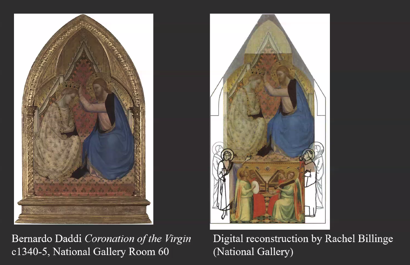
A lot of these paintings were very large, often with many panels. In the 1700s and 1800s, when the monasteries and convents were suppressed, many of these paintings were split up and the panels dispersed. There is evidence of this in Bernardo Daddi’s , The Coronation of the Virgin, c.1340-5. National Gallery. Room 60, where a digital reconstruction by Rachel Billinge, shows how the painting has lost some of its original content.
We also looked at Duccio’s, Maestà Predella Panels, c. 1307/8-11. National Gallery. Room 52, in relation to this week’s topic of context. This is what is written on the National Gallery’s website about this work:
There are different ideas as to the location of this high altar and why the altarpiece was double sided, but it is likely that the congregation had access to both sides. By 1506 the Maestà had been removed from the high altar and in the late eighteenth century it was sawn in half, causing damage to the Virgin’s face. Some fragments were sold and are now scattered across international collections; a few are now missing. The majority of it remains to be seen in the Museo dell’opera del Duomo in Siena.
Andrea di Bonaiuto da Firenze The Virgin and Child with Ten Saints about 1365-70 Egg tempera on wood, 28 x 105.8 cm Presented by Mrs Richard F.P. Blennerhassett, 1940 NG5115 https://www.nationalgallery.org.uk/paintings/NG5115
From all this it is clear that museums and galleries, such as the National Gallery, have their work cut out for them in trying to display their paintings as authentically as possibly. It is limited in what you can do in a gallery environment, but digital visualization techniques are beginning to help address some of the problems. See for example the Hidden Florence website for a flavour of how the locations, in which some of these paintings originally hung, can be recreated.
Week 5: Technique
The first half of Week 5 was led by Siân Walters, and the second half by Rachel Billinge, Research Associate in the National Gallery’s Conservation Department.
Siân Walters explored the ways in which art was created during the Medieval and early Renaissance period, focussing on two main techniques, egg tempera and fresco, as well as the development of oil painting in Northern Europe. She referred again to Cennino Cennini’s book, The Craftsman’s Handbook, as the source of practical advice, and guide to techniques used in this period.
Egg tempera was a technique used in most early Italian panel paintings. Colours were mixed with water and then bound (tempered) with a glutinous water-soluble bind medium, usually egg yolk. There are five stages to the egg tempera technique.
1. The wood panel is prepared by a joiner; the type of wood depends on what is available
2. The wood is smoothed with Gesso
3. The preparatory drawing is made on the surface of the panel
4. The preparatory drawing is covered with Bole (a kind of red clay used as a preparatory layer prior to the application of gold leaf in panel paintings)
5. Pigment bound with egg is applied to the areas of the drawing not to be gilded. Very fine brushes were used to do this, often made of squirrel fur. Lapis Lazuli was a very expensive pigment at the time, more expensive than gold, and a common pigment was terre-verte, applied under skin tones. Paintings from the 1300s, in which skin tones now appear green, would have had pink skin tones at the time. The pink has now faded to reveal the green underneath.
The term fresco[Italian: affresco] means fresh because the paint is applied on a fresh and wet layer of plaster, with the pigments dissolving into the lime water. As both the paint and plaster dry, they integrate completely. The pigment is absorbed and becomes part of the wall, rather than simply adhering to the surface as with other painting techniques. With the true fresco or buon fresco technique, the artist must apply his colours onto the wet plaster as soon as it has been prepared and laid on to the wall. (Text from Siân Walters’ handout).
As for the egg tempera technique, we were taken through the steps of how to create a buon fresco, and there was also some discussion of fresco secco, how fresco artists used cartoons to transfer their drawings to the prepared plaster, and how sections of plaster were worked on within specific time durations before the plaster dried (usually a day, Giornata). This image below shows how if you look carefully at a fresco, you can see the different sections that were painted on different days after fresh plaster had been applied to the section.
Simone Martini, Guidoriccio da Fogliano 1328, Sala del Consiglio, Palazzo Pubblico Siena (showing the different giornata)
Also discussed were the different techniques used by conservators today to remove frescoes from their original locations. (Three techniques are used, stacco a massello, stacco and strappo).
I have discovered that there are many videos on YouTube which explain fresco techniques used in different eras. This one below is specific to the era that this module covers and covers what we were told about fresco creation in medieval times. It is 17 minutes long, in Italian with English and French subtitles.
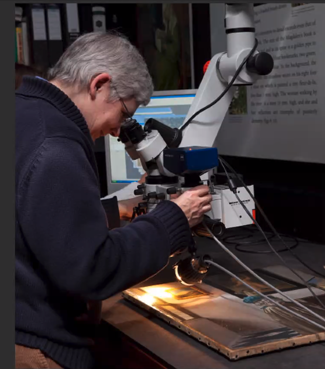
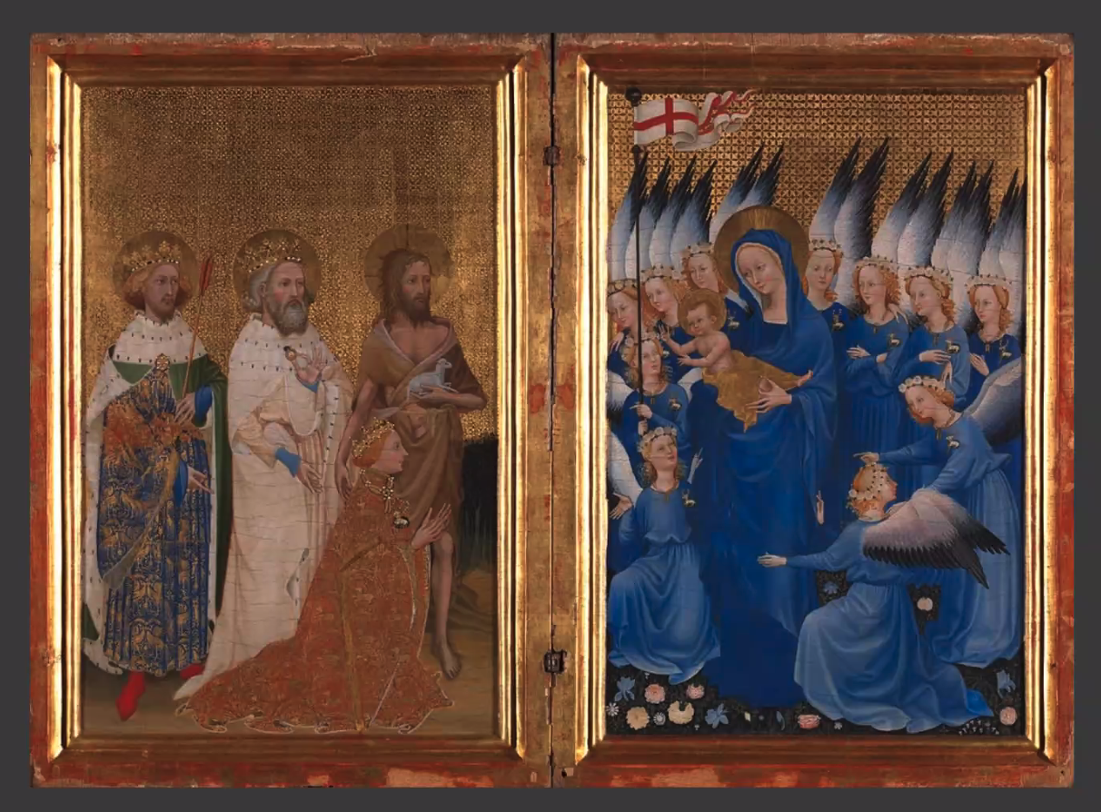
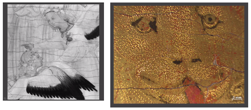
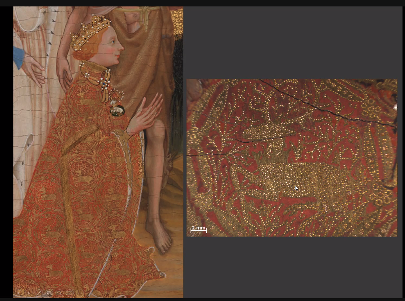
In the second half of this session, Rachel Billinge took us beneath the surface of The Wilton Diptych to explore what cannot be seen with the naked eye. This was magical to see.
The Khan Academy has produced an informative 6 minute video about this diptych, and we were given a lot of information about the diptych, how it was created (egg tempera on wood) and the symbolism within the diptych, which I do not have time or space to cover here.
But here are some of the wonderful images that Rachel Billinge has captured through her microscope.
As ever, there was far too much covered in this week to record here, but hopefully this gives a flavour of the wonderful content of this module.
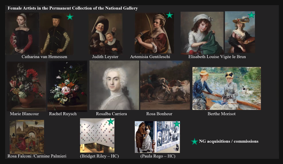
Week 6: Women and society
Whilst this is Week 6 of Module 1 of the National Gallery’s Stories of Art Online course, as mentioned before I have already completed Modules 2 to 7. Through these 7 modules the National Gallery has noticeably tried to include reference to women artists and to artists of colour. This week was introduced by Siân Walters as follows:
“Studying the art of the period 1250-1400, we could be forgiven for thinking that nearly all works produced were commissioned and paid for by men. Yet in recent years, historians have found more evidence of women acting independently. In this session, we consider their roles. What kinds of women were able to transgress gender boundaries and commission works of art? How were women depicted in paintings of the period and what does this tell us about their place in society? We also examine representations of female saints and the iconography of the Virgin Mary.” (Text from Siân Walters’ handout.)
It seems that this effort by the National Gallery to increase its representation of women’s work is much needed. Currently less than 0.5% of paintings in the National Gallery are by women and there are only 12 pieces of work by women in the permanent collection that are on view.
In addition, a number of the works of art were not acquired by the National Gallery but were bequests. In the same vein, in 2018 Sotheby sold 1000+ works of art by male artists, but fewer than 15 by women. This is beginning to change but more needs to be done and more research into why this is the case is also needed.
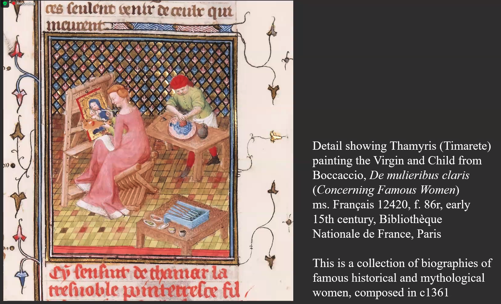
Despite the situation today, there is evidence that there were lots of women artists in medieval times. “In 1360, Boccaccio began work on De mulieribus claris, a book offering biographies of one hundred and six famous women, that he completed in 1374.” An example is seen in the painting below:
This work by Boccaccio and a closer look at medieval paintings shows that women at the time were a lot more independent than in later times and their roles were more varied. They were soldiers, builders, doctors, teachers, spinners, brewers, textile workers and guild members.
Women fighting to defend Castle, from Giovanni Boccaccio, Des cléres et noble femmes (Concerning Famous Women), Spencer Collection MS. 33, f.63v, French c. 1470, New York Public Library, New York
Women were also patrons. Can you see the patron depicted in the painting below, the small figure at the bottom right of the painting?
Anon Sienese artist, The Virgin and Child with donatrix Madonna Muccia, c.1320, Lucignano, Val di Chiana.
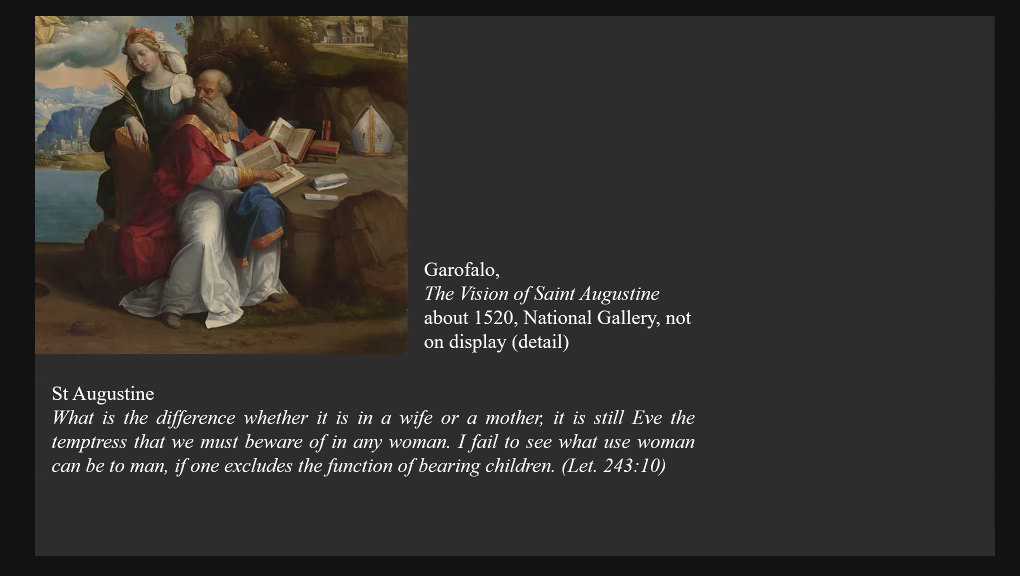
Despite all this, women still had to contend with criticism from men, and this criticism grew in Renaissance times which promoted a patriarchal society, pushing women out of the guilds and often depicting the Virgin Mary as a scarlet woman, and Eve as the source of all evil.
Once again, there was far more in this week’s content than I have space to report on here, particularly in relation to the iconography of the Virgin Mary and how she was represented during medieval times.
This is the final week in this module. It has been a surprise to me how much I enjoyed this module and how interesting I found it. I will now be much more likely to visit the sections of art galleries that have medieval work on display.
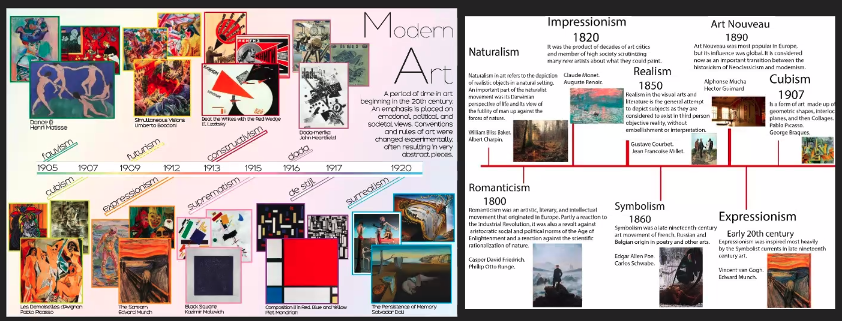
Module 7 of the National Gallery’s Introduction to Art History online course bring us up to the present day. The 20th century has seen a dramatic change in the visual arts, from representational works on canvas to conceptual art, so much so that the question ‘But is it art?’ has become a trope to describe the puzzlement felt by many towards ‘modern art’. An explosion of media has resulted in conceptual art, installations, interventions, performance and video art. In commenting on this period, Virginia Woolf wrote: ‘On or about December 1910, the human character changed.’
This module is being led by Lucrezia Walker, who got us off to a cracking, fast-paced start in Week 1, focussing on the theme of modernity.
(Interestingly, and as an aside, I am currently reading John Dewey’s book, Experience and Education. In his Preface he writes:
‘… any movement that thinks and acts in terms of an ‘ism becomes so involved in reaction against other ‘isms that it is unwittingly controlled by them.’
I think this statement by Dewey, although written in the context of education, is pertinent to a discussion of modern and contemporary art. )
I really enjoyed this week. Lucrezia Walker managed to convey the dynamic, bursting energy of the era, as she whisked us through many, many slides, vibrant with colour and movement. She started with Fauvism and the use of bright, prismatic, strong, naturalistic, unmixed colour applied directly from the tube, particularly in the work of Matisse, Derain and Vlaminck.
This experimentation with colour and style was heavily criticised, but fortunately for Matisse his work was bought by Gertrude Stein, an important patron, as was the work of Picasso, who took seriously Cezanne’s comment that ‘Everything in nature is formed upon the sphere, the cone and the cylinder. One must learn to paint these simple figures and then one can do all that he may wish’. This influence is very recognisable in Cubism. Picasso was described as an artist who could paint like a genius but was looking for more authentic ways of painting than the traditional.
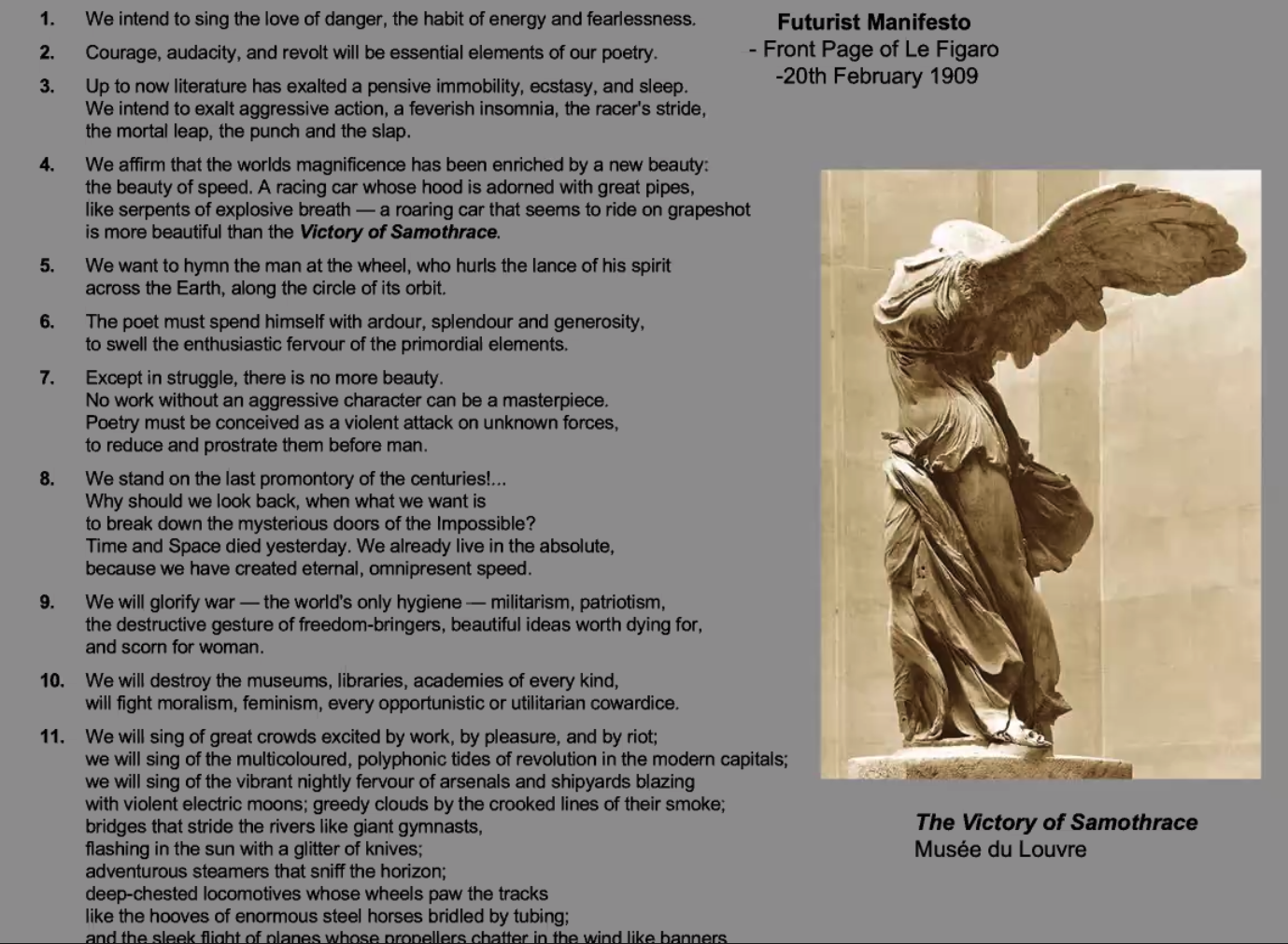
In the second half of the session Lucrezia Walker spent some time on the Futurists, who were influenced by Henri-Louis Bergson’s work on time, past, present and future, and their extraordinary manifesto. It’s not surprising that they had to draw back from their fighting talk (see point 9 in the manifesto), when one of their influential members, Boccioni, died in World War 1.
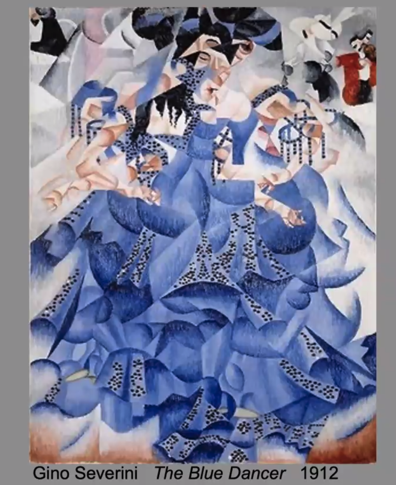
The Futurists, were fascinated by movement and shapes in flux, produced some wonderful work, too much to cover here, but Gino Severini was a leading artist in this movement.
Futurism ultimately led to increasing abstraction and artists such as Malevich (Suprematism) and the influential work of the constructivist movement in Russia. See, for example, the work of Liubov Popova.
Week 2. The road to abstraction
This was another fascinating week in which, through looking at the work of Wassily Kandinsky (in the first hour of the two-hour lecture), and Piet Mondrian (in the second), we saw a move away from the figurative and recognisable, to increasing abstraction, with a focus on colour and shape.
Kandinsky was the son of prosperous parents. He trained at art school in Odessa, but also qualified in law and economics at the University of Moscow. He began painting at the age of 30.
Lucrezia Walker took us through Kandinsky’s four steps to abstraction. (Much of the text below is taken from her slides).
In 1889 Kandinsky was part of an ethnographic research group which travelled to the Vologda region north of Moscow. In Looks on the Past, he relates that the houses and churches were decorated with such shimmering colours that upon entering them, he felt that he was moving into a painting. His painting became inspired by the Bavarian countryside and folk imagery from Russian fairy tales.
In 1896 Kandinsky saw a Monet exhibition and wrote: “That it was a haystack the catalogue informed me. I could not recognise it. This non-recognition was painful to me. I considered that the painter had no right to paint indistinctly. I dully felt that the object of the painting was missing. And I noticed with surprise and confusion that the picture not only gripped me but impressed itself ineradicably on my memory. Painting took on a fairy-tale power and splendour.” At this point, for Kandinsky, the subject of a painting decreased in importance.
Kandinsky’s work was influenced by Richard Wagner’s Lohengrin, when he became interested in how music makes us feel. He likened painting to composing music, writing, “Colour is the keyboard, the eyes are the hammers, the soul is the piano with many strings. The artist is the hand which plays, touching one key or another, to cause vibrations in the soul.” Also, at this time he was spiritually influenced by Madame Blavatsky’s work on theosophical theory, the esoteric and mystical.
Kandinsky’s work became increasingly abstract under these influences, and he began to think that shapes have certain colours, for example, a circle is blue, a triangle is yellow, and a square is red. All these influences came together in his work Composition No. 4
From this time on, Kandinsky’s work became increasingly abstract. By 1923 abstraction completely eclipses the figurative in Kandinsky’s work.
There was a lot more said about Kandinsky in this session that I do not have space to cover here, but Wikipedia provides a good overview of his life and work.
Kandinsky is thought to be the first abstract painter, but Lucrezia Walker showed us the work of Hilma af Klint, Georgiana Houghton and Emma Kunz, all of whom were producing abstract work earlier than Kandinsky. However, perhaps because they were inspired by theosophy, interested in healing and mysticism, experimenting with symbolic investigation, and claimed to be guided by the spirits, they were not taken seriously, and their work was not included in later exhibitions alongside Kandinsky and Mondrian.
In the second half of this session, we had an equally in depth look at the work of Piet Mondrian (1872-1944), who took abstraction even further. What I didn’t know about Mondrian was that originally his name was spelt Mondriaan. He changed it in 1912 after seeing cubist art in Paris. Mondrian started work as a post-impressionist, but by 1908 his work was becoming more abstract, and by 1914 it was completely abstract. Like Kandinsky he was very interested in theosophy and tried to take what he saw from the outside world and distil it down for spiritual resonance. He was looking for harmony and rhythm, and trying to get as close as possible to the truth. Lucrezia Walker’s text on this slide below explains Mondrian’s approach to the use of primary contradictory colours.
We were shown many more slides of Mondrian’s work, which has been very influential on the work of other artists, such as Roy Lichtenstein, fashion design and commercial design, e.g., the Rubik cube.
Week 3. Dada and Surrealism
This was another intense week which covered far more than I could possibly recount here. The session was in two parts, with input on the radical anti-art movement, Dada, covered in the first half and Surrealism covered in the second half.
Dada was quite a short lived movement (1915 – mid 1920s) born out of negative reaction to the horrors of WW1. It was begun by a group of artists and poets associated with the Cabaret Voltaire, a nightclub started by Hugo Ball in Zurich. The Cabaret Voltaire was only open for a few months, but the group of poets, performers and artists who presented their work there, created an entirely new sensibility which was to have a century of ramifications.
‘Dada rejected reason and logic, prizing nonsense, irrationality and intuition. It was an anti-art art, and a state of mind and being. The origin of the name Dada is unclear; some believe that it is a nonsensical word. Others maintain that it originates from the Romanian artists Tristan Tzara’s and Marcel Janco’s frequent use of the words “da, da,” meaning “yes, yes” in the Romanian language. Another theory says that the name “Dada” came during a meeting of the group when a paper knife stuck into a French–German dictionary happened to point to ‘dada’, a French word for ‘hobbyhorse’.’ (text from Lucrezia Walker’s handout)
What is Dada?
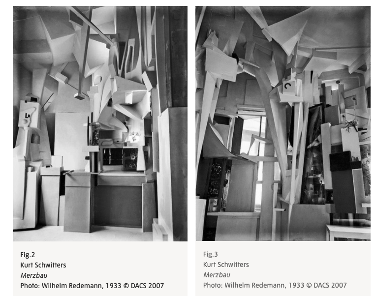
This video covers much of what we were introduced to in the first half of this session, but Marcel Janco’s and Kurt Schwitters’ work was used to illustrate the Dadaists’ use of low art materials, such as cardboard, and Man Ray and Marcel Duchamp were both referenced in relation to work that used ‘found objects’ and work that raised the questions ‘What counts as art? What is art? Is anything in an art gallery art? New to me in this session, was Kurt Schwitters’ Merzbau (Merz building). This extraordinary work no longer exists as it was destroyed in the war.
Ultimately Dada morphed into Surrealism. This movement was founded in Paris in 1924 by a group of poets, painters, and filmmakers. Instrumental in this was the writer and poet André Breton. Breton studied medicine and psychiatry, and was very interested in the disturbed mind and a proponent of automatic writing, which led to him authoring the First Surrealist Manifesto in 1924.
The Surrealists were inspired by the power of the unconscious mind – a concept Sigmund Freud had made famous. They saw the unconscious (revealed most clearly in dreams) as the source of all imagination and believed that art should try to express its contents. The word surreal has entered the lexicon to describe situations that strike us as dreamlike. Key elements in Surrealist practice are the random and the unexpected, chance and coincidence, sex and desire.
What is surrealism? Thisvideo attempts to answer this question.
Salvador Dalí was the most prominent and probably best known Surrealist, and we were shown many slides of his work in the second half of this week’s session.
‘Surrealist painting generally fell into two distinct categories. Artists including Salvador Dalí, René Magritte and Yves Tanguy, made hyper-real paintings with dream-like subjects depicted in minute precision, adding to their otherworldly quality. Other painters such as André Masson explored automatism, tapping into their unconscious mind to create expressive images. Breton defined automatism as, ‘pure psychic automatism … the dictation of thought in the absence of all control exercised by reason and outside all moral or aesthetic concerns’. Other artists such as Joan Miro moved between the two styles, and frequently used both techniques within the same work of art.’(text from Lucrezia Walker’s handout)
For the Surrealists beauty was to be ‘convulsive’ and came about by chance. Objects which bore no reference to each other derived new beauty or significance through random juxtaposition.
Week 4. Abstract Expressionism to Pop
The first half of this week was presented by Guest speaker Chloe Julius, University College, London. I found this session difficult to follow as she showed 93 slides in less than an hour, and the work of so many different artists that it’s difficult to know where to start in trying to summarise this. Among the artists she mentioned were: Mel Bochner, Frank Bowling, Yayoi Kusama, Anne Truitt, Andy Warhol, Lee Krasner, Willem De Kooning, Helen Frankenthaler and Barnett Newman. Maybe I found this session difficult to follow because, for the most part, this art doesn’t resonate with me. Or perhaps the problem with this session was that there was just too much to take in and I didn’t get a sense of what the key points were. The Tate Gallery explains Abstract Expressionism on their website and The Royal Academy has published a beginner’s guide, both of which I find helpful. The Tate Gallery also explains Pop Art on their website. I have chosen one of the slides of Barnett Newman’s work to share here, since Newman was considered a leading figure in Abstract Expressionism.
I found the second half of this week much more interesting. Lucrezia Walker is a very good storyteller, and she also appreciates that less can be more. There were only 38 slides in this session, which focussed mainly on the action painterJackson Pollock, and the colour field painterMark Rothko.
‘Pollock famously placed his canvas on the ground and danced around it, pouring paint from the can or trailing it from the brush or stick. In this way, the action painters directly placed their inner impulses onto the canvas.’ (Text from Lucrezia Walker’s handout).
In this photo we see Pollock working, with his wife Lee Krasner in the background. Krasner was also an artist but only became successful after Pollock’s death. At this time there were other artist couples, where the wives tended to be marginalised, e.g. Willem de Kooning’s wife, Elaine de Kooning, and Robert Motherwell’s wife, Helen Frankenthaler.
Mark Rothko was a colour field painter. He painted large canvases of more or less a single flat colour, intended to produce a contemplative or meditational response in the viewer, a transcendental moment, a religious experience. Rothko wanted his paintings to be about tragedy, ecstasy and doom, and to be the visual equivalent of music. When exhibited, he insisted that his canvases were not glazed or framed and were placed low down on the wall near the floor. Both Pollock and Rothko epitomised the artist as tortured genius. Rothko committed suicide, and Pollock died in a car crash as a result of driving under the influence of alcohol.
This session ended with a brief reference to Pop artist Andy Warhol, who evidently hated Abstract Expressionism, thinking that his work was more democratic. Warhol worked in his studio, which he called The Factory, with a team of people. Rothko worked on his own. Andy Warhol’s popular art was about popular things such as Campbell’s Soup Cans. Roy Lichtenstein was also a Pop artist, who took non high art images and made them big, i.e., he made big art out of things that are not important.
Week 5. YBAs (young British artists) and who writes the canon
At the start of this week Lucrezia Walker had to point out, following questions about this, that she is not able to cover every significant artist of the period in her lectures. In the first half of this session, she showed us the work of some of the better known young British artists and discussed some artists who never made it into the canon (the agreed list of artworks that is valued and considered worthy of study).
The YBAs (noted for ‘shock tactics’) caused a sensation when a collection of their work, owned by Charles Saatchi, was exhibited at the Royal Academy in 1997. The exhibition was aptly called Sensation and generated controversy, particularly in relation to Marcus Harvey’s’ huge depiction of Myra Hindley, made of hundreds of copies of a child’s handprint (ink and eggs were thrown at this picture), and in relation to Chris Ofili’s controversial painting, The Holy Virgin Mary. The painting depicted a Black Madonna surrounded by images from blaxploitation movies and close-ups of female genitalia cut from pornographic magazines, and elephant dung.
Lucrezia Walker described Damien Hirst as a genius, who has gone from strength to strength. He not only knows how to create the impossible and extraordinary, and the value of a gimmick (dead animals in formaldehyde), but having worked in an art gallery, he understands how to get people like Saatchi on board. Lucrezia pointed out that some other artists today have also realised that they can exploit a gimmick, e.g., Grayson Perry and his alter-ego Clare.
But there are some artists who have not been collected despite the quality of their work. Although Jenny Saville’s work was included in the Sensation exhibition, her work has not been as sought after as Hirst’s or Emin’s. For example, the Tate has work by Tracey Emin, Sarah Lucas, Angus Fairhurst, Mat Collishaw, Cornelia Parker, and Tacita Dean, but not by Jenny Saville.
This has also happened to other artists. Michael Andrews’ work was valued alongside Frances Bacon’s and Lucien Freud’s until he moved out of London to Norfolk for a quieter life with his family, when he lost his place at the centre of things. And Jack Vettriano, a self-taught artist, who began painting at the age of 19, and who sells more in reproductions than anyone else in Britain, doesn’t have a gallery that represents him.
Jack Vettriano. The Singing Butler. 1992
In the second half of this week’s session, artist Raksha Patel discussed aspects of her practice and how seeing the Sensation exhibition influenced her practice.
Week 6. Where are we now: women, diversity and collectives
This final session of this module started with a look at how difficult it has been for female artists to be considered seriously. This attitude started to change in 1961 with the art of Nicky de St Phalle who created paintings by shooting at bags of paint on a canvas and allowing the dripping paint to create the image. This image of a woman yielding a fire-arm was in direct opposition to the usual image of women seen as nude models for art, as seen in Yves Klein’s Anthropometries series (Performance art), where he used nude female modes as ‘living brushes’.
This kind of male dominated art ultimately led to the Guerrilla Girls pushing for feminist art (and change), with their text-based, funny images, which incorporated clear messages of gender politics. Below is one of their best known images, but there are many more.
We then went on to look at the wonderful work of Frida Kahlo, who was well known by her death and portrays herself as psychologically raw in a mixture of realist and surrealist styles.
And we also saw, amongst others, the work of Paula Rego. I specifically mention her, because I will see her work at the Tate, when I visit London next month.
Diversity was discussed in this session by looking at the work of Zanele Muholi (a South African visual activist and photographer) and Yayoi Husama, whose work I was lucky enough to see at an exhibition in Denmark in 2017.
The session ended with a fascinating look at the work of street artists and a discussion of how this impacts on the art market. How do street artists make their money? In particular we looked at the work of Banksy. Lucrezia Walker suggested that Banksy makes his money because his work is well executed, often politically engaged and funny. What I found interesting was that Lucrezia told us that she knew the name of Banksy, but she didn’t divulge it. It seems important that we don’t know the true identity of Banksy, who for the general public, like me, remains anonymous, creating his graffiti art works beyond the public eye.
Jean-Michel Basquiat was also a promising graffiti artist, who unfortunately died young, at the age of 27. We had a brief look at his work.
As ever, there was far too much in this session and module to cover in one blog post, but let’s end with two challenging statements. Do you agree with them?
Module 6, the penultimate module of the National Gallery’s course, Stories of Art. A Modular Introduction to Art History, covered 19th century art. The module was presented by Dr Amy Mechowski, and during the six week course, three of the sessions featured an in-depth contribution from guest speakers, who presented the second hour of the two hour weekly session. In this first week, the guest speaker was Dr Susanna Avery-Quash
The 19th century was an age of unprecedented cultural, political, and social change. This module explored how this period of change was manifested in works of art. It also paid particular attention to paintings in the National Gallery and the work of the National Gallery, since it was in the 19th century that the National Gallery was established.
This has been a difficult module to reflect on in one blog post. It was so packed with information and images that it has been hard to know what to include. It was also quite hard to follow, simply because of the sheer weight of content. I sometimes think less might be more.
Week1: A New Age and a New Gallery
In this first week Amy Mechowski didn’t focus on particular artists, rather she gave us an overview of the influences of the long 19th century on art and artists. The long 19th century is a term coined by Russian literary critic and author Ilya Ehrenburg, and British Marxist historian and author Eric Hobsbawm, for the 125-year period comprising the years from 1789 to 1914. This period included the avant-garde in the first half of the 19th century and the start of modernism in the late 19th century/early 20th century. The avant-garde was a pathfinding force, characterised by unaccepted change, when artists were leaders alongside scientists and other change makers.
There remains debate about when modernism started – was it 1900 with fauvism, or 1800 with Romanticism, or 1850 with realism? The 19th century was an era of ‘isms’!
The great events that influenced art of the 19th century were the French Revolution, the Industrial Revolution and those leading up to the First World War. The spirit of revolution marked this century. This was the century of The Great Exhibition, and the development of photography, a century characterised by contradiction between modernity and tradition, urban and rural life, and popular and high class. There were also issues around gender and social class, and these boundaries between the social classes were explored by artists such as Degas. What was appropriate for the working classes? Should they too visit museums, as the middle class were beginning to do? There were also issues around freedoms, equality and representations.
These issues were all reflected in the collections of the National Gallery which was finally established in 1824 through the efforts of Lord Liverpool, Charles Long and Sir George Beaumont. Prior to this art was only seen in private collections or occasionally in museums. The presentation in the second half of this week by Susanna Avery-Quash, focussed on the first director of the National Gallery, Charles Eastlake, and how through his work, and extensive travel abroad to see and collect art, he managed to change the direction of the National Gallery’s art collection and introduce a new acquisition policy that would extend and diversify the collection.
Week 2: Academies and Rivalries
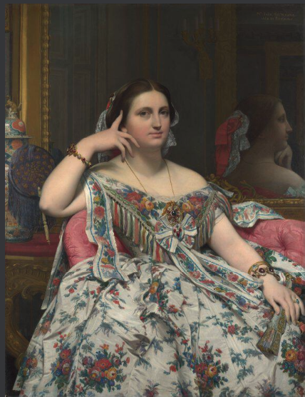
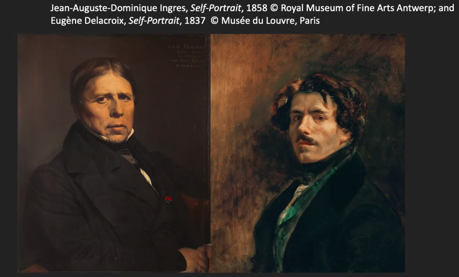
In this week Amy Mechowski gave two lectures. For the first hour she focussed on The Academy: Neoclassicism and Romanticism. In the early 19th century academic art looked to classical art for inspiration. History painting (classical history and mythology) was at the top of the hierarchy of importance, followed by portraiture, genre painting, landscape and cityscapes, animal painting and finally still life. Neoclassicism was driven by The Enlightenment and the practice of going on Grand Tours as artists became familiar with the work of the Greeks and Romans. Neoclassical art is characterised by simplicity and sedate grandeur, austere clarity, moral truth and political purpose. Amy Mechowski put forward Jacques-Louis David’s work as the best example of Neoclassicism, and Jean Auguste Dominique Ingres, a student of David’s, as the high priest of Neoclassicism. Ingres was a superb draughtsman and master of drapery and texture as we can see from this painting of Madame Moitessier, which took 12 years to complete and underwent several revisions.
Notable in Ingre’s work is how he played with composition, making many preparatory drawings, how he often painted women in front of mirrors, and the rubbery quality to his painting of flesh as can be seen in Madame Moitessier’s right hand. There is quite a story behind this painting which you can listen to on the video on the National Gallery’s website. See https://www.nationalgallery.org.uk/paintings/jean-auguste-dominique-ingres-madame-moitessier
In the second hour, Amy Mechowski focussed on Romanticism and Rivalries, referring back to the rivalry between Ingres (Neoclassicism) and Delacroix (Romanticism), mentioned in the first hour ….
…. and then focussing on the rivalry between Turner and Constable in the period of Romanticism.
Delacroix was considered the greatest French Romantic painter. In comparison to Ingres, his work was loose, non-conformist, sketchy and expressive. These two artists showed the conflict between head and heart, the Neoclassicist Ingres’ paintings being dignified, restrained and balanced, and the Romanticist Delacroix’s paintings being passionate, rich and fiery in comparison. Romanticism was a response to disillusionment with the Age of Reason. It centred on imagination and emotion, the nature of man, and nature itself as unpredictable and violent, rather than ordered.
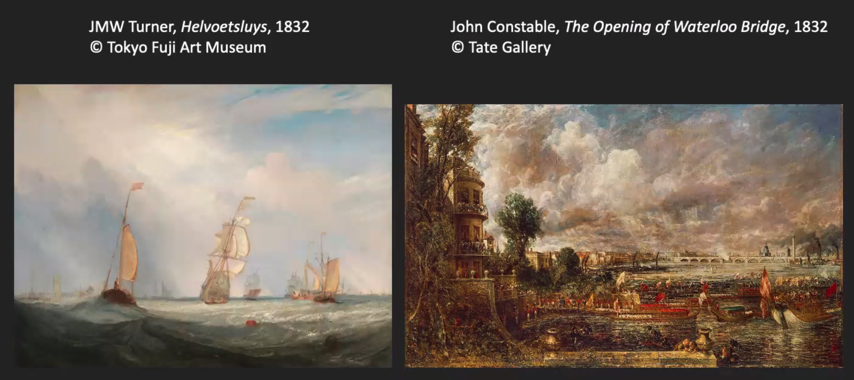
Landscape was a favoured subject for Romantic artists, as we see in the work of Turner and Constable, two very different artists, from very different backgrounds, who produced very different work. There was great rivalry between Turner and Constable which was depicted in Mike Leigh’s film Mr Turner (2014) which dramatized the moment that Turner and Constable clashed over two of the paintings they submitted to the Exhibition in 1832.
Both artists had radically new approaches to painting and the use of paint, which are discussed in some of the National Gallery’s videos. Watch Colin Wiggins give an entertaining, informative and in-depth talk on The Hay Wain (1821) in this video – https://youtu.be/aJVLyuk2cxI and Christina Bradstreet talk about Turner’s ‘Rain, Steam and Speed – The Great Western Railway’ (1844) in this video – https://youtu.be/N8mf9y6ziXA
Week 3: Realism, Naturalism and Representation
As mentioned before, this module is proving difficult to capture in brief weekly notes. Dr Amy Mechowski has chosen to take a themed approach to each week, rather than focus on a particular artist. This seems to work against my purposes of making a record of each week in a brief paragraph, so these notes are shared on the understanding that they only present a fraction of what was presented, but even so this post is going to be very long!
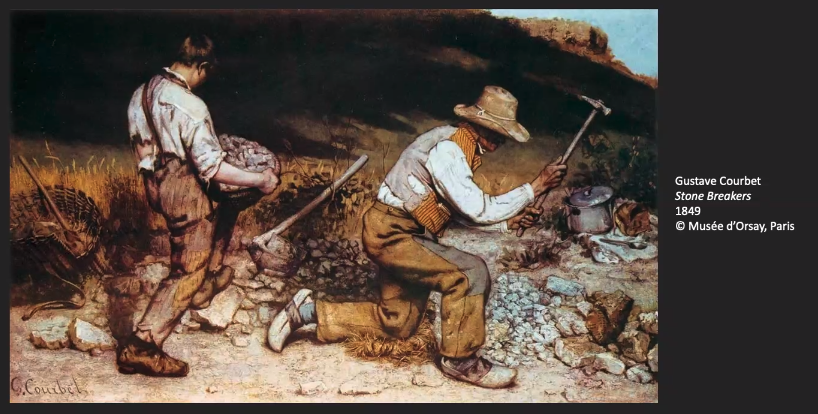
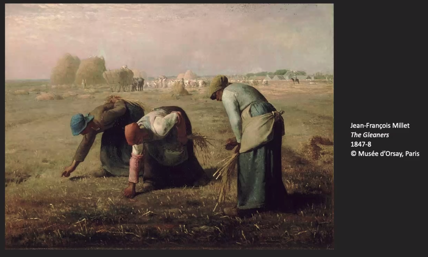
In the first half of this week’s session, Amy Mechowski discussed realism and naturalism in 19th century art with particular attention to the work of Gustave Courbet and Jean-Francois Millet, in France, as well as the Pre-Raphaelite Brotherhood in England. These artists moved away from the traditional, classical and romanticist approaches of the past, to representing things closer to the ways we see them, often painting landscapes and other scenes from life out-of-doors (naturalism) and painting everyday life in a realistic, almost photographic way. Naturalism and realism took many forms, but often had a political edge, commenting on, for example, people working the land, through direct observation of the modern world.
Courbet’s paintings were rejected by the Palace of Fine Arts, but this didn’t deter him. He instead set up his own one-man independent exhibition, establishing himself as a Realist.
Similarly Millet’s honest depiction of rural poverty, made the upper classes uncomfortable and caused a scandal. Millet’s subjects were considered subversive.
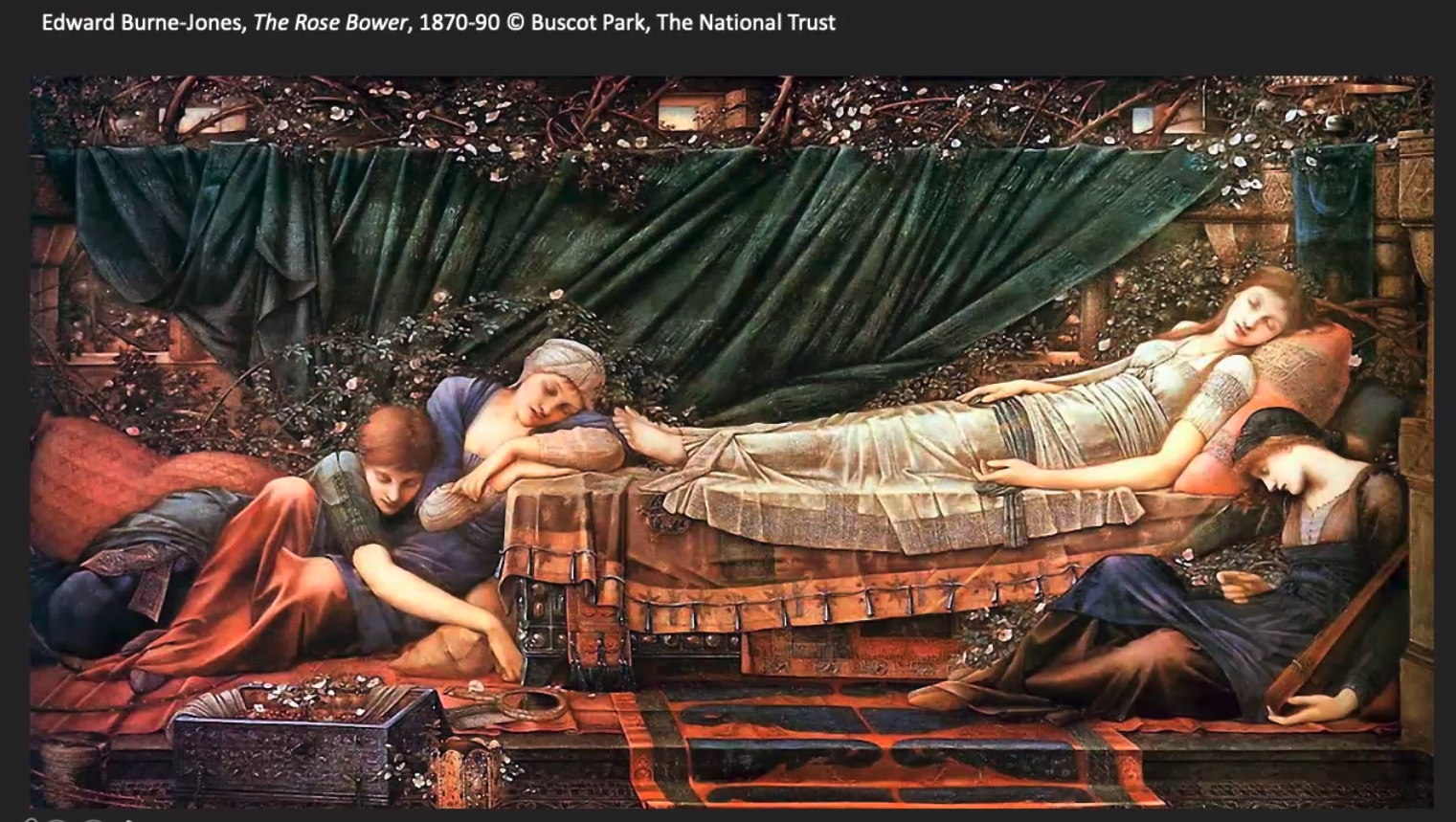
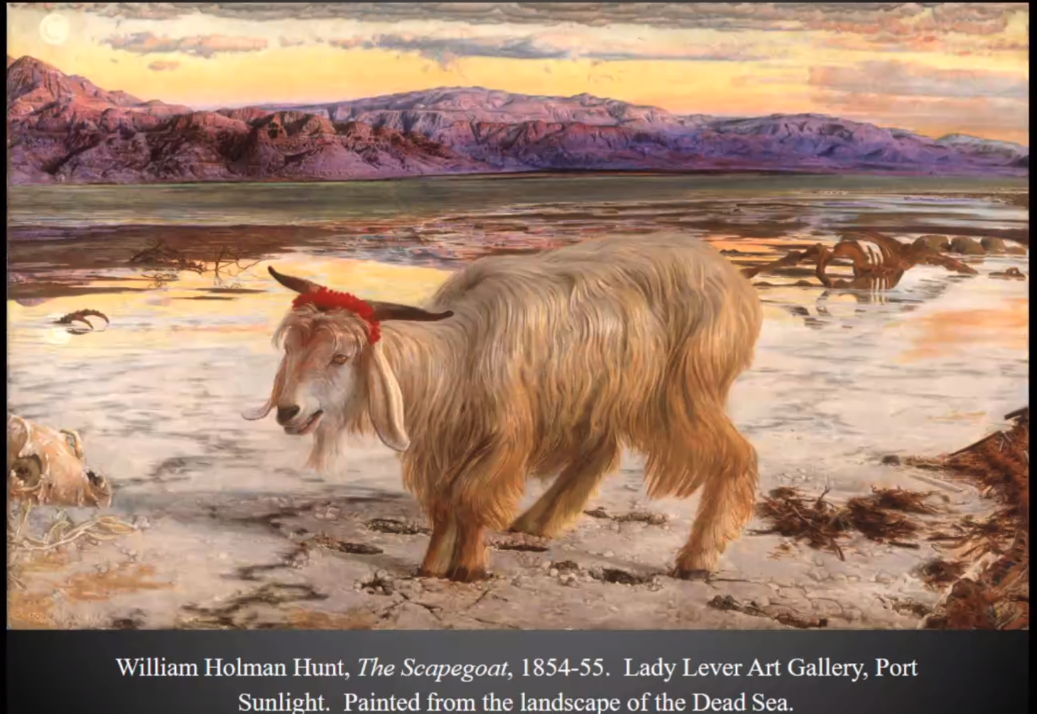
The Pre-Raphaelite Brotherhood, founded by William Holman Hunt, John Everett Millais and Dante Gabriel Rossetti (but later joined by a number of other artists) were also keen observers of the natural world, who were championed by the art critic John Ruskin. They studied nature attentively and recorded what they observed in minute detail. Some of the Pre-Raphaelites were fascinated by medieval culture and ultimately the group divided to follow two different directions. The Realists were led by Hunt and Millais, while the medievalists were led by Rossetti and his followers, Edward Burne-Jones and William Morris.
In the second half of this week’s session, Dr Jenny Graham explored the concept of representation through the ‘Realism’ of the Pre-Raphaelite painter William Holman Hunt, with a particular focus on his Holy Land pictures, which were explored in relation to empire, religion, travel and colonialism. Holman Hunt had a life-long interest in the Middle East. Jenny Graham told us that he tried to civilise other lands with his paintbrush in one hand and his bible in the other. The Scapegoat is an example of this.
Through quotes from his personal diaries and by close examination of his paintings we see that Holman Hunt was a product of his times, i.e. inherently racist, deeply influenced by the norms of the British Empire and colonialism.
Week 4: The Painters of Modern Life
The Painter of Modern Life is the title of an essay by Charles Baudelaire, who urged painters to break from historical narratives of the past and paint contemporary Paris and modern urban life. Baudelaire used the term ‘flaneur’ (meaning ‘stroller’ or ‘loafer’) to describe these observers of modern urban life. As such Baudelaire approved of Edouard Manet’s paintings which were considered shocking at the time.
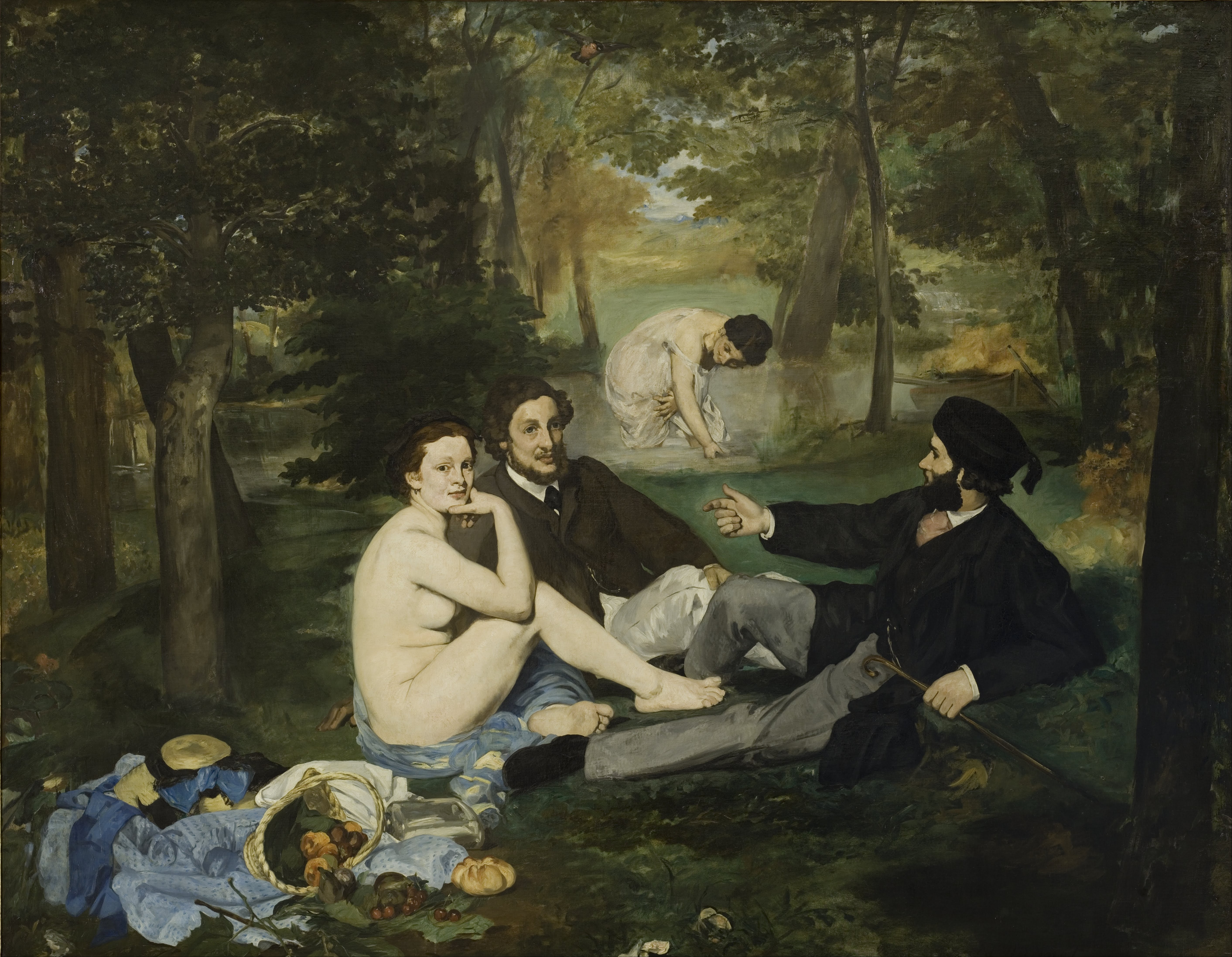
Manet blurred the lines between genders and social classes and broke a lot of the accepted rules of perspective and application of paint. Consider the tree trunk which almost splits his painting, Music in the Tuileries Gardens, in two, and the blue triangle of sky at the top of the painting. His handling of paint was loose and sketchy, finished yet unfinished, and his technique had a flattening effect, flattening space and figures. Manet’s paintings were refused by The Salon in Paris, but Napoleon III instituted the Salon des Refusés, where Manet exhibited instead. Even there his paintings, which were blatantly defiant, caused a scandal, particularly his nudes, which were of real people, not idealised; naked, not nude.
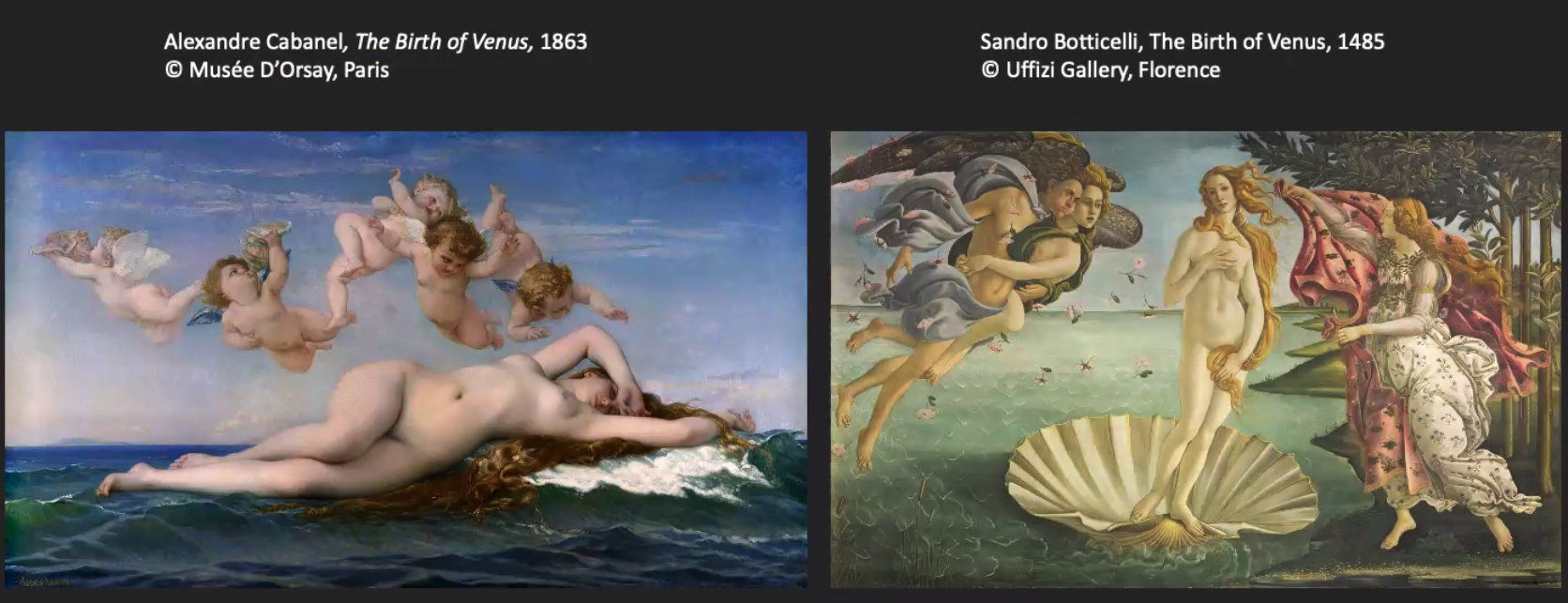
At the time, there was a large tradition of painting nudes in the standard drawn from classical art, in which the line and form were smooth and soft, with no distortions. Colours were muted with the figures painted in pale white, depicting virtue, and often painted as part of a narrative, a character in a story.
Historically the female nude had been painted by men for men, as exoticised ‘others’, but with the influence of the changing times, the re-organisation of neighbourhoods in Paris, the rise in employment and of the lower middle class, and the increasing development and influence of photography on painting, rules were being broken in many aspects of life, and the nude was toppled from its lofty pedestal. Developments in painting in the 19th century were shaped by shifting socio-cultural and political structures, which were manifested in challenges to a hierarchy of genres in painting as well as themes of identity, representation and performance. The iconic, sensual nude became a vehicle for provocation, experimentation and radical departures in painting.
Week 5: The Advent and Advance of Impressionism
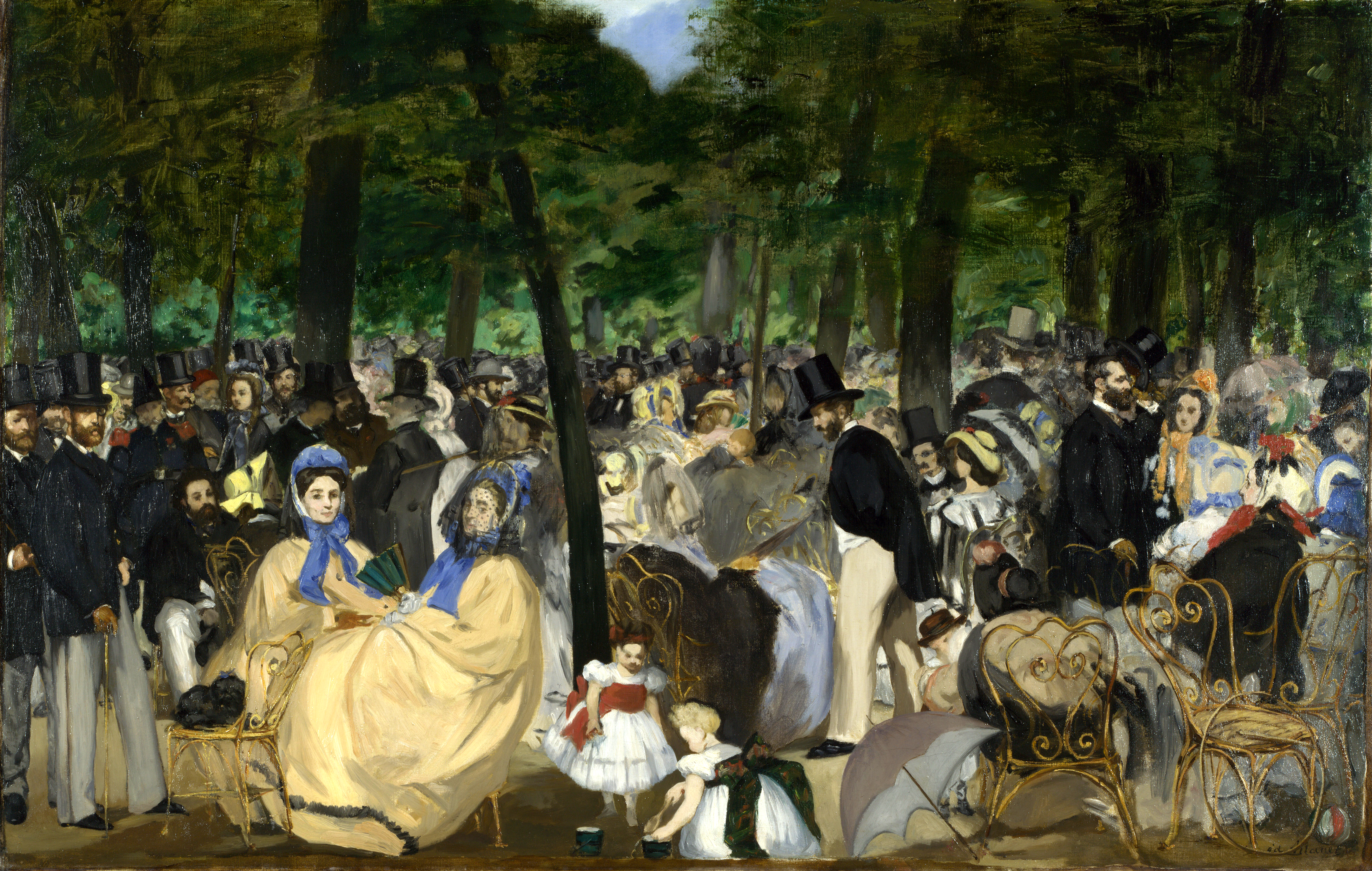
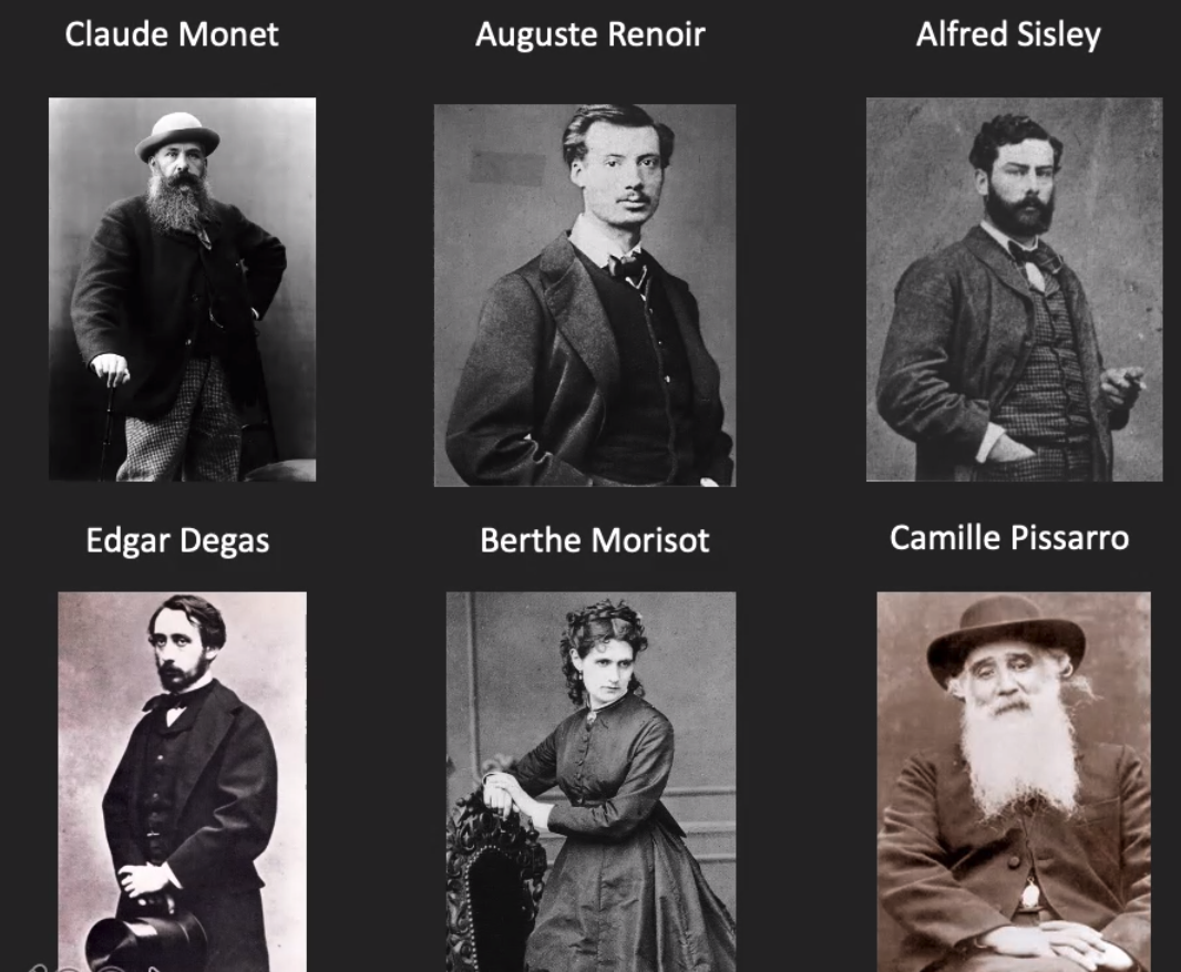
With their first independent exhibition in 1874 (not at The Salon, where they refused to exhibit) , Monet, Renoir, Sisley, Degas, Morisot and Pissarro became household names. There is something inspiring about their refusal to exhibit at The Salon. What courage of their convictions they must have had in the face of severe criticism of their work, which rejected the traditions of the time.
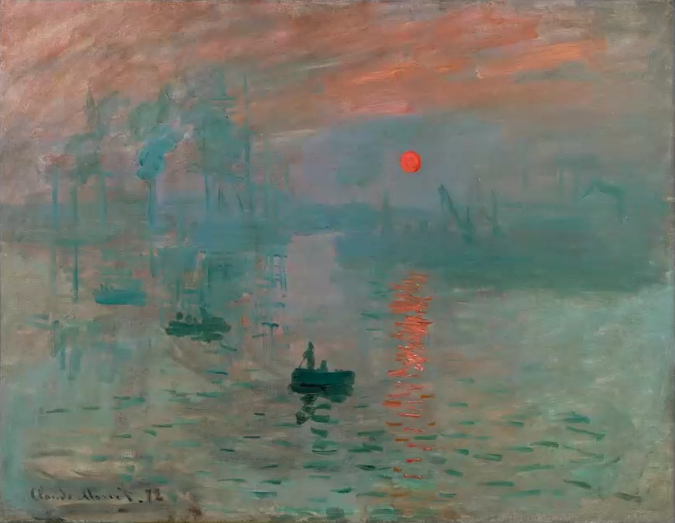
This group did not call themselves impressionists at the outset. The movement started with Monet’s painting bearing the title Impression.
Claude Monet, Impression, Sunrise, 1872. Musee Marmottan Monet, Paris
A great variety of work was produced by the Impressionists. Manet was linked to this group, and a good friend of Monet’s, but wasn’t an impressionist and didn’t refuse to exhibit at The Salon. The Impressionists painted modern life and structures, for example, trains, railways, cities; strong and vulnerable women; and images of rural leisure. Bathing was also a popular subject at this time. See for example the work of Degas, Caillebotte and Eakins. The impressionists adopted a radical technique of short, broken, loose and sketchy brushstrokes, such that their works looked unfinished. The development of oil paints in screw top tubes and folding easels and stools, meant that they could, and did, work outdoors. They painted straight from the tubes, using unblended, bright colours, paying close attention to the effects of light. This was a time of opportunity and new freedoms for women, as we see in the work of Mary Cassatt and Berthe Morisot. Also, at this time, trade was re-established with Japan for the first time in 250 years, and the influence of Japanese design and pattern can be seen in the work of many artists in Europe, and in the work of James Abbott Whistler, who was considered the quintessential American impressionist.
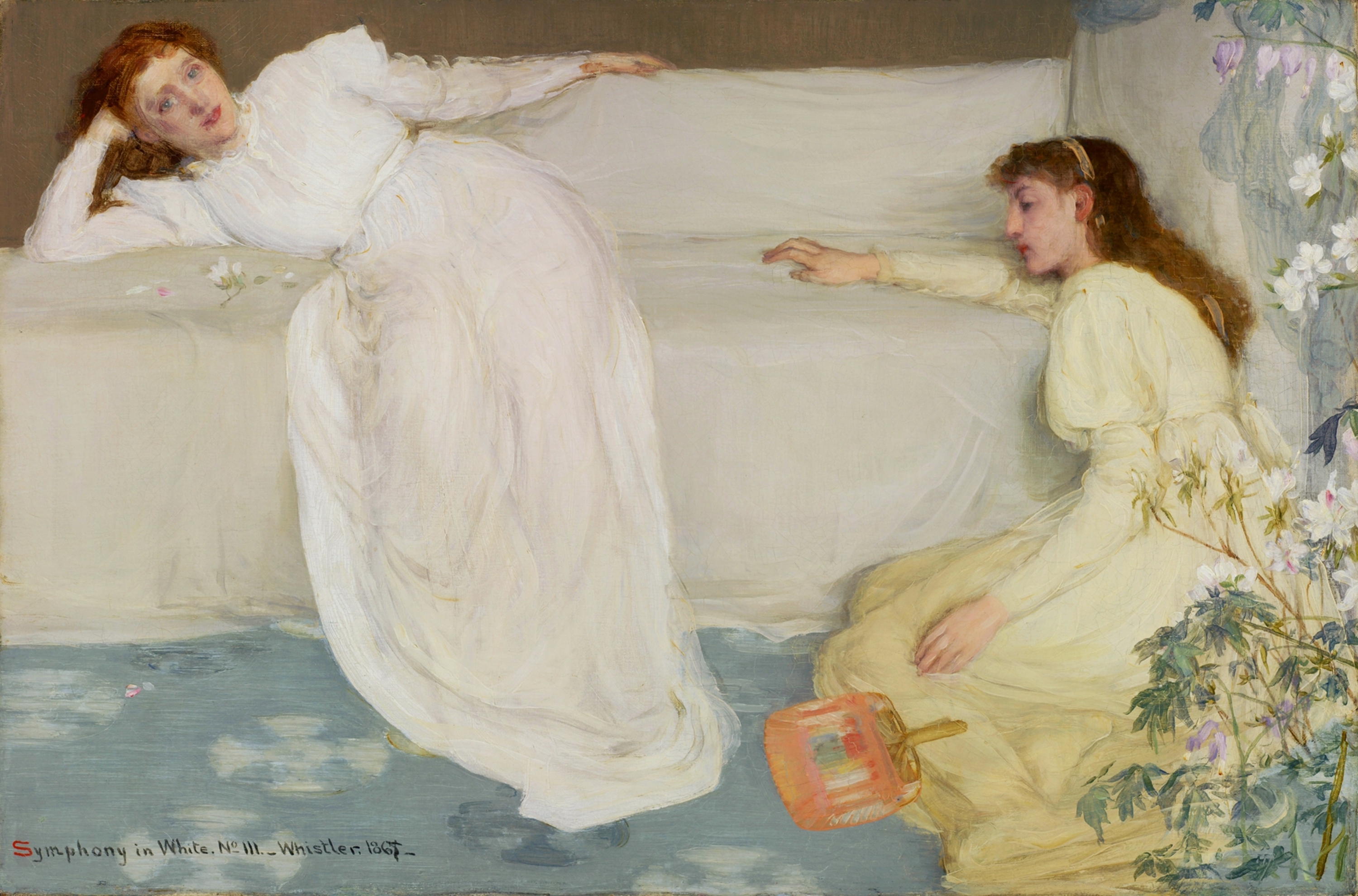
In the second half of this week’s session Dr Jenny Graham focussed on Whistler’s paintings and the theme of ‘whiteness’, with reference to race, gender and the public display of art in London and Paris. For Whistler white is a philosophical, artistic and theoretical problem. He explores how white is not a single tone, but many tones with lots of intricate shadows, in his beautiful series of three Symphony in White paintings Unlike other Victorian artists of the time, Whistler was more interested in what paint can do, rather than the politics of the time, an approach that is known as ‘Art for art’s sake’. He wanted painting to be a sensory as well as a contextualised experience. His three Symphony in White paintings were considered shocking, not because they were experimental, but because the subject (Whistler’s mistress) looks like a fallen woman, a girl who has lost her virginity.
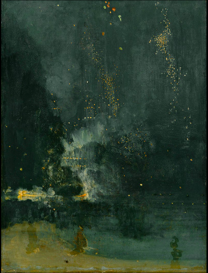
But it was Whistler’s painting Nocturne in Black and Gold. The Falling Rocket, which caused the most scandal, inviting severe criticism from John Ruskin, who thought Whistler had asked too much money for a painting in which there was no evidence of any work. Ruskin thought labour should go into a work of art. Whistler sued Ruskin for libel, and won, but ultimately the trial bankrupted him. Dr. Caroline Ikin talks about their argument on YouTube https://youtu.be/dLmWqkggaiM
James Abbott McNeill Whistler, Nocturne in Black and Gold – The Falling Rocket, c. 1875
Week 6: The Crisis of Impressionism and Beginning of a New Century
The Impressionists held eight independent exhibitions and with every passing year the artists became more divergent from the characteristics which initially bound them together. The eighth exhibition in 1886 included artists who would later be called the Post-Impressionists. Once again many, many slides were shown this week, but the focus paintings were:
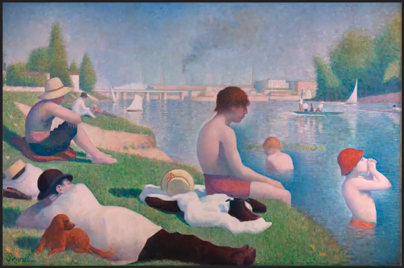
This is painted in Pointillist style, a Post-Impressionist technique developed by Seurat. Paul Signac also helped to develop this style, which explored the use of complementary colours and gave the paintings a shimmering effect. Pissarro also experimented with Pointillism, but after a few years returned to Impressionism. See, for example, his painting Late Afternoon in our Meadow.
Gauguin was influenced by the work of Seurat and Signac. He too moved away from Impressionism. Gauguin is best known for his primitive, non-Western art; its simplicity, sincerity and expressive power, and also for his relationship with Van Gogh for whom he painted this self-portrait.
Gauguin’s style of Post-Impressionism has been termed Cloisonnism, a technique in which areas of bold, flat colour are separated by strong, dark contours. Gauguin also used the term Synthetism to describe his work.
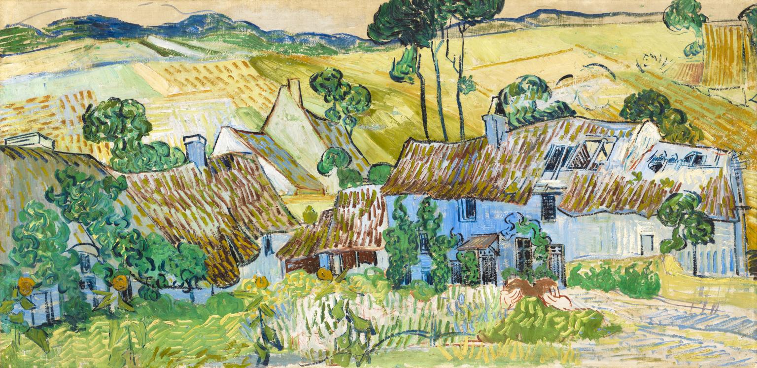
The second half of this week’s session was devoted to Van Gogh and Cézanne. Some things I didn’t previously know about Vincent (as he liked to be called) are that he was largely self-taught, a prolific painter, producing 900 paintings and 1000 works on paper between 1880 and 1890. He loved the work of Millais and copied his paintings. He was deeply religious, and his famous sunflower paintings are evocative for Christians, for just as the sunflowers turn to follow the sun, so do Christians turn to follow Christ. I knew that his mental health was fragile and that he cut off his ear, but I didn’t know that he took his own life in 1890, shooting himself in the chest. This was his final, but unfinished painting, before he died. Farms near Auvers, 1890.
This module ended with a focus on Cézanne, who is considered the founder of 20th century modernism. Cézanne was a Neo-impressionist. He used subtle gradations in colour to build form and create three-dimensional space, and anticipated cubism with geometric shapes. Cézanne was interested in how the human eye sees and how our minds process different perspectives.
The final Module 7 in this online course, Stories of Art. A Modular Introduction to Art History starts on Wednesday 14th July, and will cover 1900-2021. I expect it to be just as packed with content.
Module 5 of the National Gallery’s course, Stories of Art. A Modular Introduction to Art History, covered 18th century art. This six week online course was presented by Dr Richard Stemp, who wrote in his introductory handout:
The 18th century was an important period of change across Europe. The death of Louis XIV in France led to a relaxation in court life, which led to a far lighter touch in French art, and the development of Rococo.
(I have included lots of images in this post. Clicking on them enlarges them.)
Week 1: A lighter touch
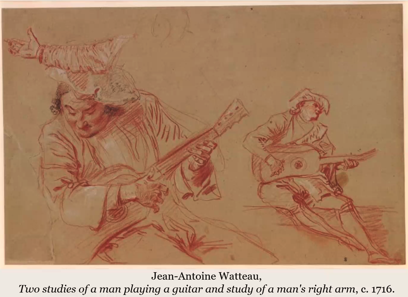
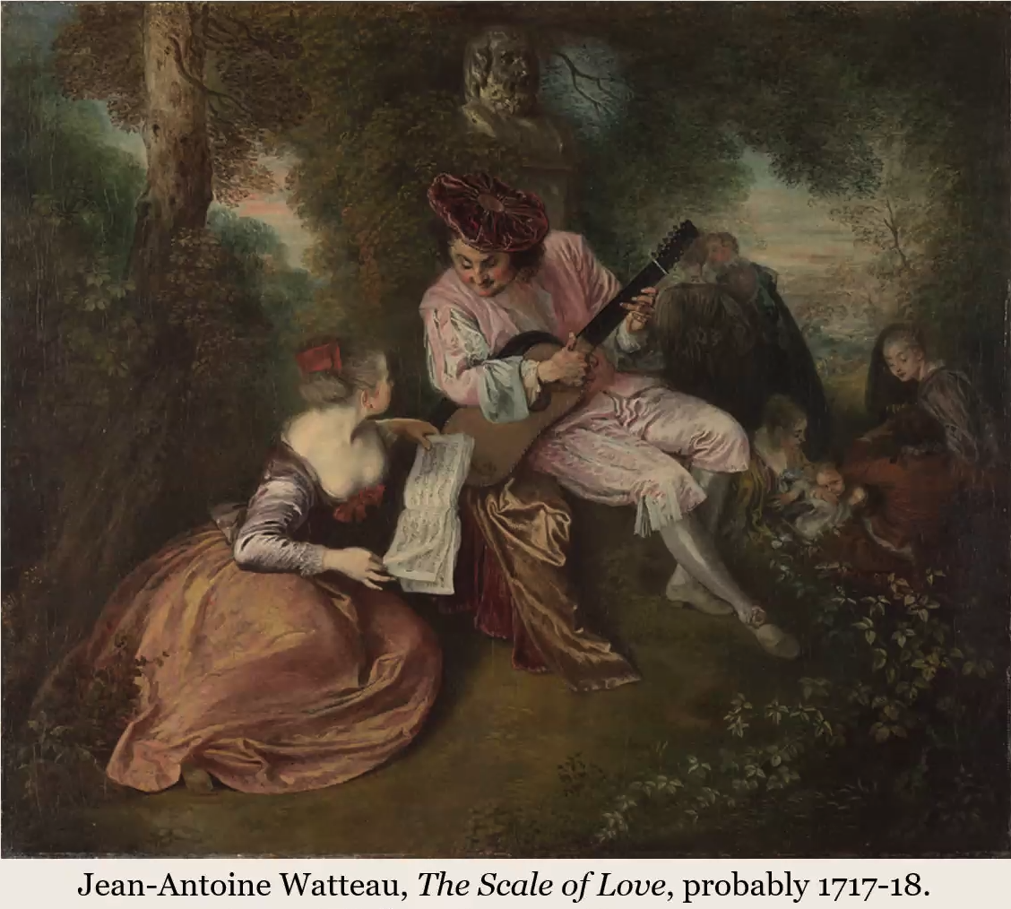
Baroque art of the 17th century had suited the bold dramatic style of Louis XIV and his court in Versailles. With his death, and the ensuing regency, the court returned to Paris and became more relaxed. Two artists whose work flourished in this new lighter atmosphere were Jean–Antoine Watteau and William Hogarth.
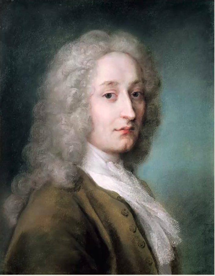
Watteau was born at Valenciennes in the north of France and arrived in Paris in 1702 where he began to paint. He died in 1731 at the age of 36 from consumption. This lovely portrait of him, was painted by Rosalba Carriera (who was enormously popular in the 18th century and did wonderful work in pastels).
Watteau himself is considered one of the greatest of Rococo artists. His paintings were observations of society, normal people doing normal things. In the tradition of Rubens, he used red, white and black chalk for drawings, before he started to paint, creating hundreds of drawings which he used over and over again in his paintings.
E.H. Gombrich writes of Watteau, ‘The qualities of Watteau’s art, the delicacy of his brushwork and the refinement of his colour harmonies are not easily revealed in reproductions. His immensely sensitive paintings and drawings must really be seen and enjoyed in the original.’ I also think that it really helps to be able to zoom in on his paintings, which is an advantage of an online course.
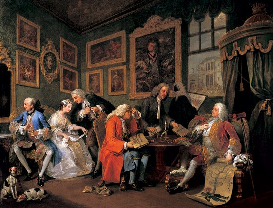
In Week 1 we also examined in close detail Hogarth’s first series dedicated to ‘Modern Moral Subjects’, Marriage A-la-Mode.
William Hogarth, Marriage A-la Mode: 1. The Marriage Settlement, 1745
Hogarth’s paintings exposed the follies and vices of the age. He was the finest and liveliest British portrait painter of the time, a man with a well-developed sense of cynical humour, and also an engraver, so he sold many prints of his work.
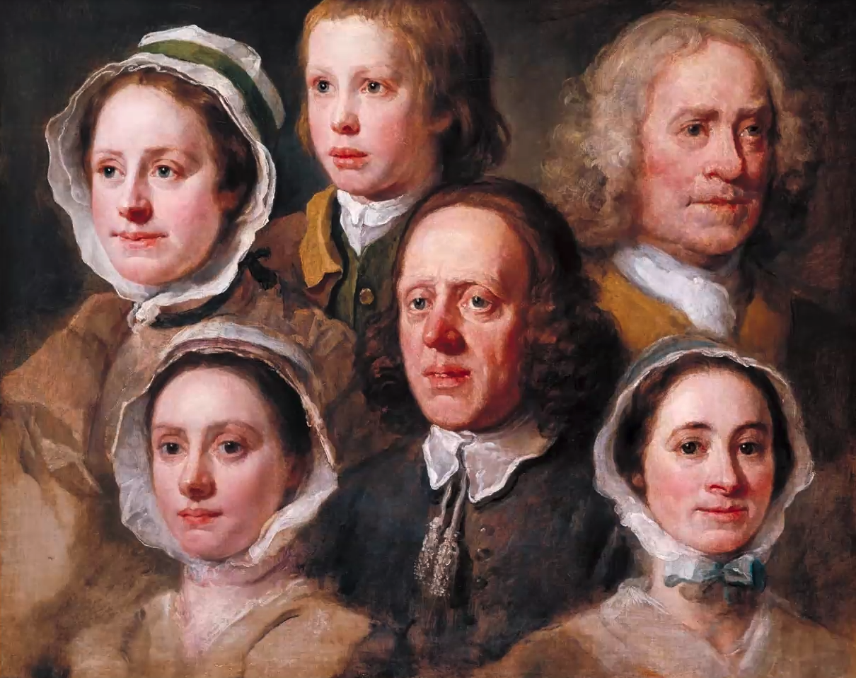
In Week 4 we were shown this painting, which illustrates his skill as a portrait painter.
William Hogarth, Heads of Six of Hogarth’s Servants, c.1750-1755. Tate Britain, London.
Week 2: Defining the Rococo
In this week we were shown the work of a variety of artists of the period and at least 120 slides to explore the differences between Baroque and Rococo art. It seems that Rococo art is difficult to define. Some think that it’s not a style at all but a form of late Baroque, others that it is a style in its own right; it’s not what the baroque is. In his book Baroque and Rococo, Gauvin Alexander Bailey writes :
‘Baroque (c.1580-c.1700) grew out of the Catholic Reformation, and is a powerfully persuasive style based on rhetoric and drama, whereas Rococo (c.1700 – c.1800) began as décor, a whimsical, more intimate style that values ornamentation over structure and is more concerned with pastoral and exotic forms than with weighty theological or historical themes.’ (London: Phaidon, 2012)
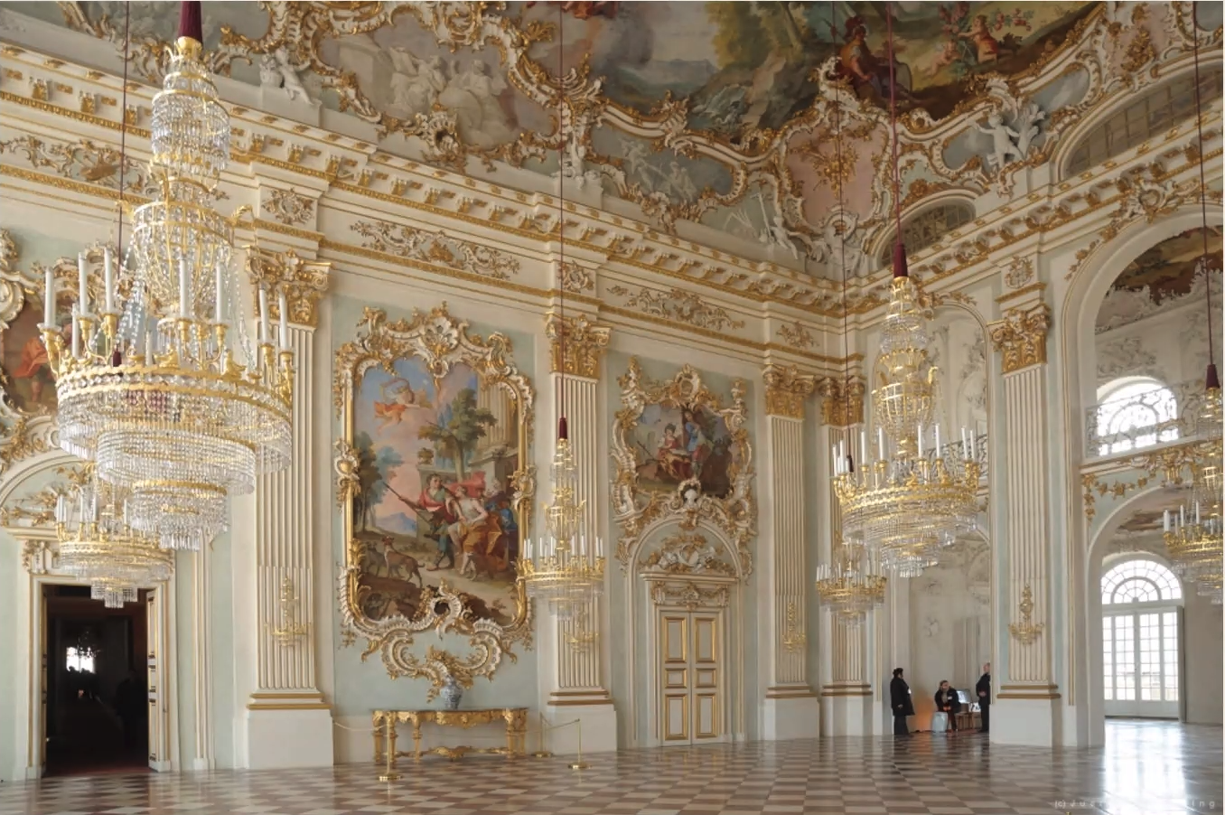
Henrico Zucalli and J.B. Zimmermann, The Great Hall, 1701-2 and 1755-58, Nymphenburg Palace, Munich
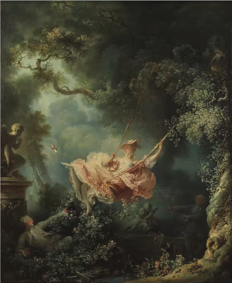
Rococo art was described in this lecture as frilly, and joyful in its approach. Whereas Baroque art is bold and symmetrical, characteristics of Rococo art are asymmetry, and sinuous S-shaped scrolling curves. Rococo paintings were described as effervescent, gentle and elegant, employing soft, gentle colours and grounded in the world of imagination. An example of this is Jean-Honoré Fragonard’s The Swing. There couldn’t be a more Rococo painting than this.
This frothy, titillating painting is considered one of the quintessential works of Rococo art. Fragonard was influenced by the work of François Boucher and Giambattista Tiepolo.
Week 3: The Grand Tour
The 18th century was the time of the grand tour. Photography had not been invented so the best way to see European art was to travel to Europe, which many young gentlemen (known as ‘bear-cubs’) did, in the company of a tutor (the ‘bear-leader’), after studying at either Oxford or Cambridge (the only two Universities that existed at the time). These tours usually took about eighteen months, and of course they also served the purpose of ‘sowing wild oats’. The most common tour was to travel from England through France to Italy and down through Venice to Rome and Naples, but some ‘bear-cubs’ travelled further afield, and later in the century it became fashionable to travel to Wales, Scotland and the Lake District, no doubt attracted by the likes of Wordsworth and Coleridge.
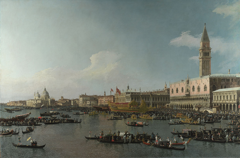
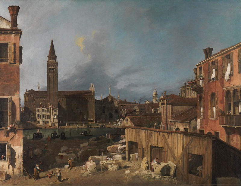
And since there was no photography in this era, what better way to capture memories of the tour than by buying paintings, either of memorable sites and monuments, or of having your portrait painted in situ. Even Goethe had his portrait painted in Italy on his grand tour. So, at this time artists could make money by painting souvenirs. Notable amongst these artists was Canaletto, who is known for his many, many paintings of Venice. Typical of these paintings is The Basin of San Marco on Ascension Day.
To really appreciate Canaletto’s skill, visit the painting on the National Gallery’s website and zoom in, where you can see the extraordinary amount of detail in the painting and in his other paintings.
In this week’s session we saw many of Canaletto’s paintings of the Grand Canal in Venice and those which Canaletto painted of the Thames whilst living in England. We also saw how Canaletto’s work influenced other artists and architecture of the time, but we didn’t discuss this lovely painting (below) of The Stonemason’s Yard, although we were recommended (as homework) to watch a really interesting video of Associate Curator Francesca Whitlum-Cooper giving a talk about this painting – https://youtu.be/03BfPn6xrSo
Canaletto
The Stonemason’s Yard
about 1725
Oil on canvas, 123.8 x 162.9 cm
Sir George Beaumont Gift, 1823; passed to the National Gallery, 1828
NG127
https://www.nationalgallery.org.uk/paintings/NG127
I think I prefer this painting to the canal paintings. Maybe because there are so many Canaletto paintings of the Grand Canal in Venice. There are even two in the Bowes Museum in County Durham, not so far from where I live.
Week 4: Crossing Genres
Part 1: A New Face for Portraiture
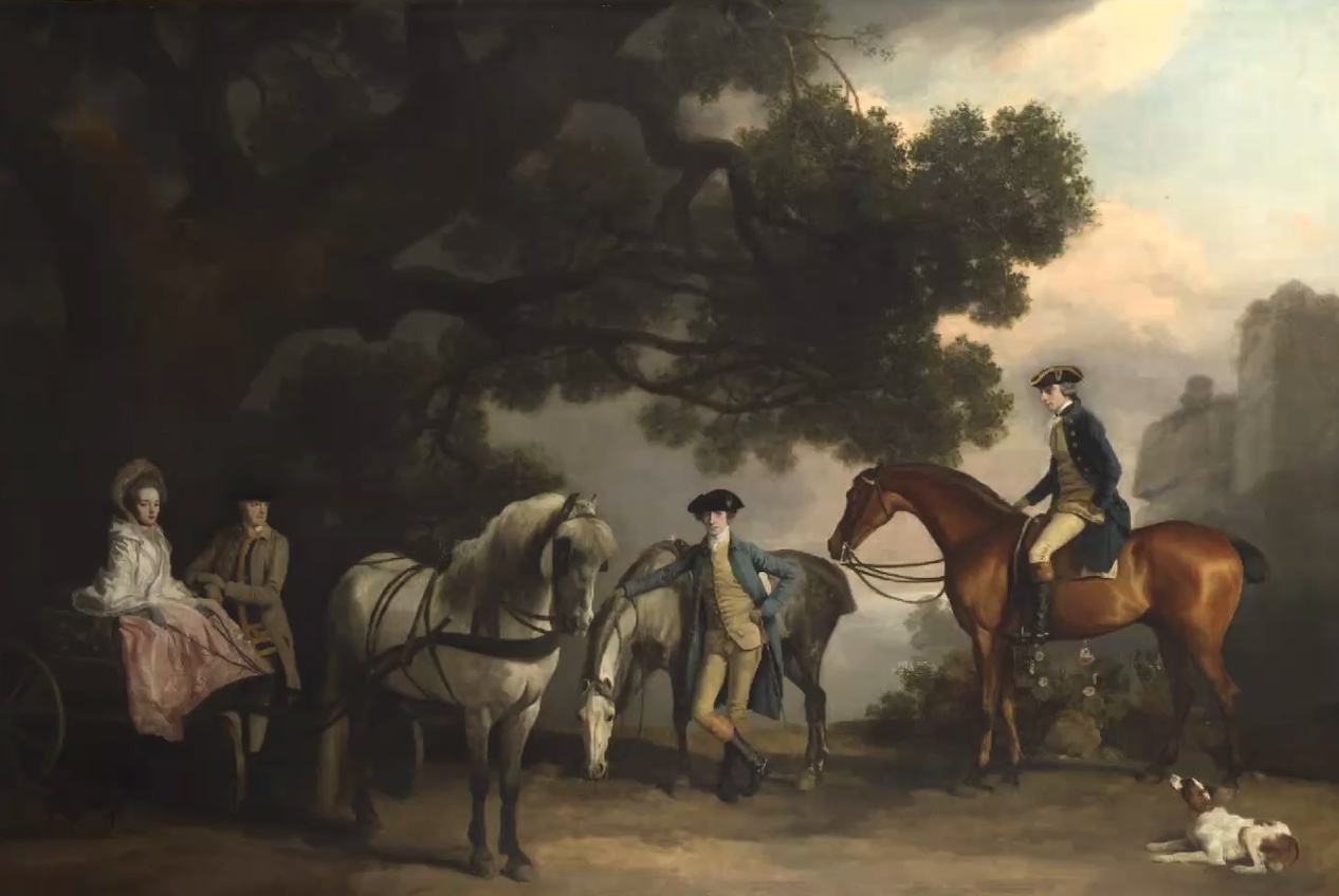
The first half of this week’s two hour session was presented by Richard Stemp, who discussed the new face of British Portraiture in the 18th century. He focussed on three artists, Thomas Gainsborough, William Hogarth and George Stubbs. Gainsborough combined portraiture and landscape painting; portraits made more money than landscapes, so many landscape artists turned to portraiture. Gainsborough’s famous painting Mr and Mrs Andrews, is an example of this, and also an example of a conversation piece, a type of painting that became popular at this time and depicted an informal group portrait in which people are gathered together and involved in real or imagined activity. The National Gallery has a very entertaining video on its site of a variety of people discussing this painting – https://youtu.be/g_w–aEYmH8 Hogarth also painted a number of conversation pieces, as did Stubbs, but in the case of Stubbs the portraits were often of animals (particularly horses) as well as people, set in landscapes and depicting a narrative.
George Stubbs, The Milbanke and Melbourne Families, c.1769. National Gallery, London
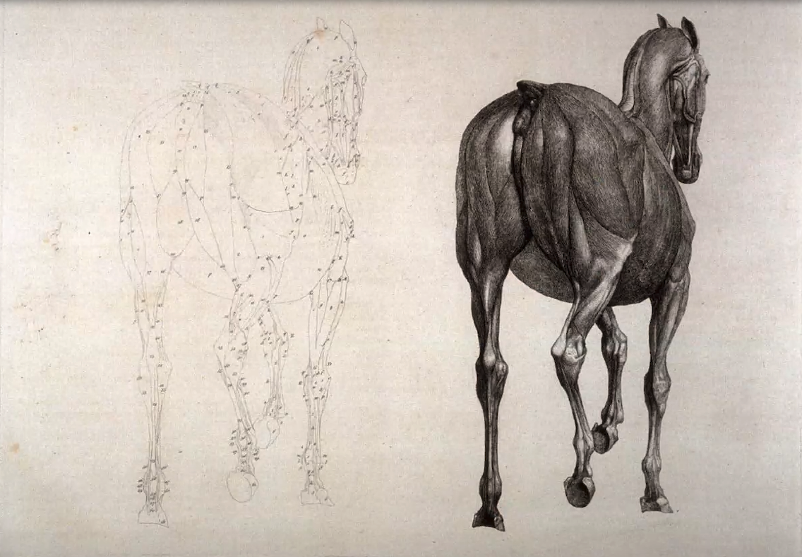
Stubbs studied the anatomy of horses, dissecting them and making many anatomical drawings which he later used to inform his paintings.
George Stubbs, Plate for the Twelfth Anatomical Table of the Muscles, Fascias, Ligaments, Nerves, Arteries, Veins, Glands, and Cartilages of a Horse, viewed posteriorly, explained, which is the twenty-first plate in the book, The Anatomy of the Horse, London, 1766
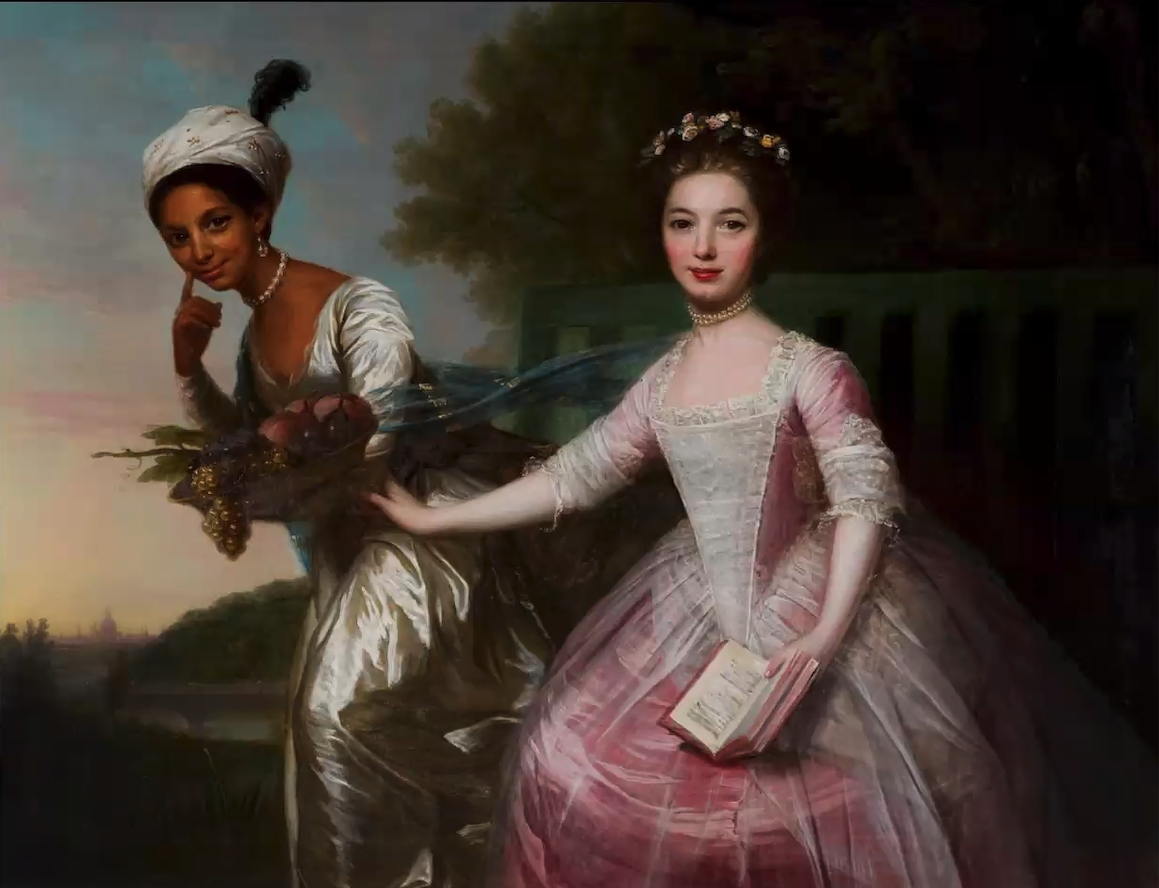
Part 2: Dido Elizabeth Lindsay Belle (1761-1804) and the Beginnings of Abolition
The second half of this session was presented by Leslie Primo, who traced the beginnings of abolition through the eyes of Dido Elizabeth Belle, a black woman living in Kenwood House in the late 18th century. Through looking closely at her portrait by David Martin, and other art work of the time, we observed the emphasis in 18th century art on white skin superiority, and considered how Dido was depicted as an exotic other, and what her life might have been like.
David Martin, Dido Elizabeth Belle and Elizabeth Murray, c.1779, Scone Palace, Perth, Scotland
Week 5: Taking things seriously – Academies and Enlightenment
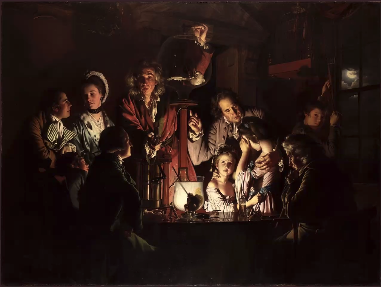
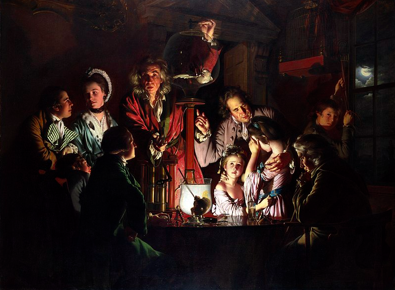
In the first half of this week’s two-hour session, Richard Stemp discussed how during the 18th century art was changing, from the ‘lighter touch’ of the Rococo period, to the more serious period of the Enlightenment (the Age of Reason), focussing on advances in science and philosophy. This was illustrated by discussion of Joseph Wright of Derby’s painting An Experiment on a Bird in the Air Pump, which depicts a scientist conducting an experiment during which a vacuum is created by the air pump, which for a moment robs the bird of the air it needs in order to breathe. The people in this painting are ‘being enlightened’ and their faces are lit up.
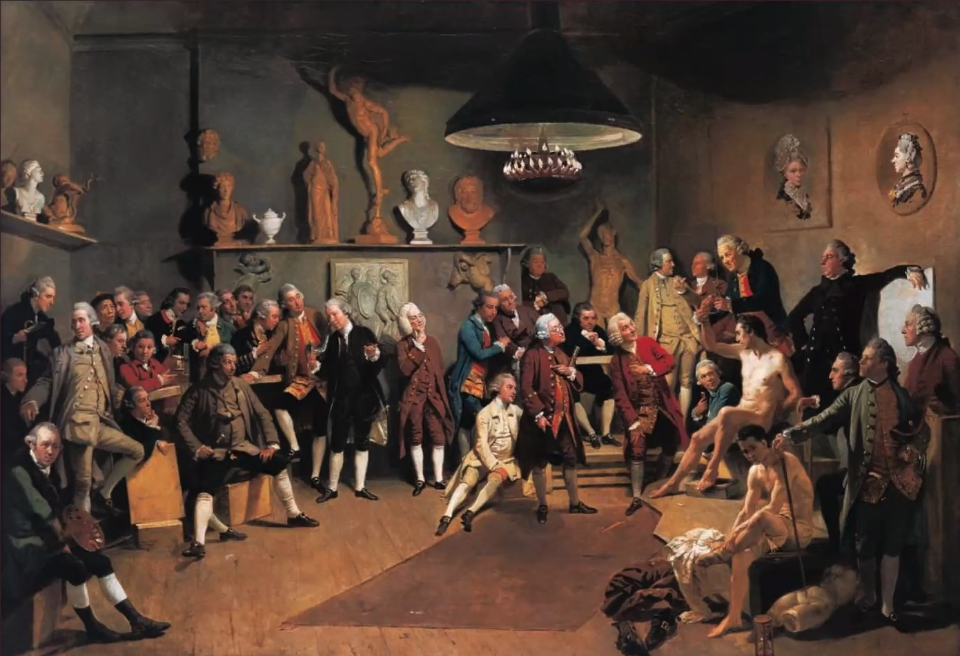
Richard Stemp then went on to discuss some of the great thinkers so of the age; Mary Wollstonecraft, Jean-Jacques Rousseau, Denis Diderot (who published the first encyclopaedia and became one of the first art critics), Voltaire, Goethe, Johann Joachim Winckelmann and Edmund Burke. These thinkers encouraged artists to take art more seriously, which led to the founding of the British Royal Academy, depicted here by Johan Zoffany.
Artists working at this time included Francisco Goya, François Boucher, Jean-Baptiste Greuze, Jean-Simeon Chardin, William Gilpin, Joshua Reynolds, Angelica Kauffmann and Mary Moser. As women, Kauffmann and Moser did not attend the academy, although Kauffmann was one of the most successful artists of the time and hugely wealthy; their portraits are displayed on the wall.
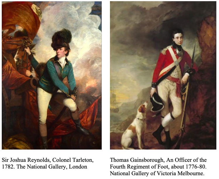
The second half of this week’s session was led by Dr Jenny Graham, Associate Professor (Reader) in Art History at the University of Plymouth, who spoke on the cult of sensibility and changing representations of masculinity in 18th century art, with reference to the paintings of Reynolds, Gainsborough, Chardin, Boucher and Greuze. We were shown a wide range of portraits showing the shift from portraits of men of power, very often symbolised by the white stockinged masculine calf, to softer representations of men of feeling, surrounded by nature, or depicted as loving husbands and tender fathers, often seated amongst their family. These two portraits below by Reynolds and Gainsborough, which have taken similar subjects, show the shift from Reynolds’ benchmark portrait of machismo, to Gainsborough’s pensive officer, lost in thought.
Changes in artistic style are the result of many overlapping ideas – political, historical and theoretical. From the Renaissance onwards, an interest in the antique had been one of the major forces behind artistic style, but the focus had always been on ‘Rome’ as the highpoint of classical civilization. In 1764, Johann Joachim Winckelmann’s History of Ancient Art was one of the first books to distinguish between the arts of Greece and Rome, and to identify the primacy of the Greeks. At this point, the ‘Neo-Classical’ was born – the perfect antidote to the apparent superficiality of the Rococo. It became the perfect language for French revolutionaries to express the earnestness of their beliefs about the decadent monarchy, and an ideal form of expression of dignified intent for the revolutionary turned Emperor, Napoleon Bonaparte.
There was far too much information packed into this week to cover in this very short reference to Week 6 of this module. Neo-Classical art was described as rational rather than emotional, with its origins in Greek sculpture. Neo-Classical art exhibits noble simplicity and quiet grandeur. It is cool, calm and sophisticated, with sculptures being white and paintings worked in subdued colours. Richard Stemp said, Baroque is like dark chocolate; Neo-Classicism is like spearmint, and Baroque is like full fat cream; Neo-Classicism is like skimmed milk. Many artists were referred to in this session. Here are some which exemplify Neo-Classical art.
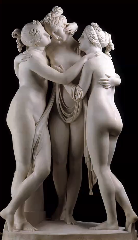
Antonio Canovo, The Three Graces, 1814-17
Anton Raphael Mengs, Self Portrait in Red Mantle, 1744
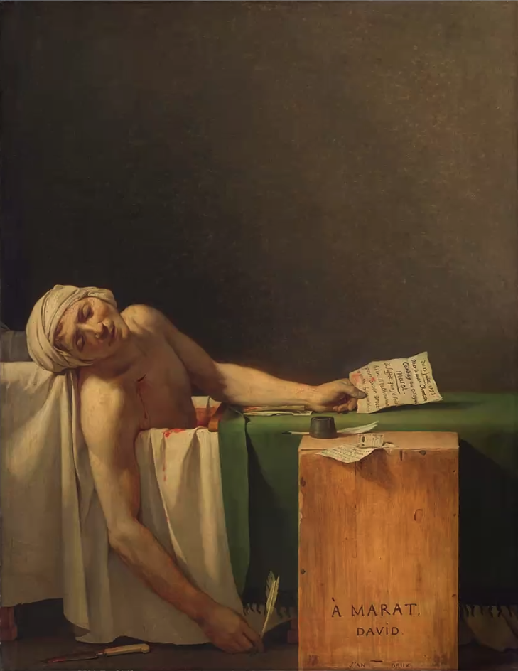
Jacques-Louis David, The Death of Marat, 1793
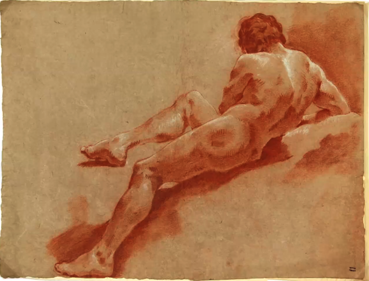
And these wonderful male nudes by Giulia Lama (1720-23). Most women artists at this time worked from sculptures rather than directly from the male model, but Giulia Lama broke with the convention of the time.
Module 6 will be led by Dr Amy Mechowski and will look at 19th century art (1800-1900).
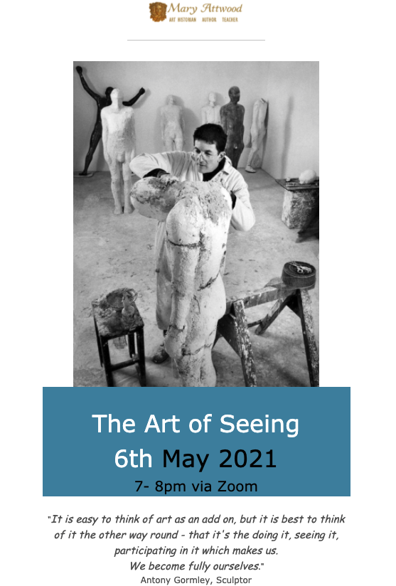
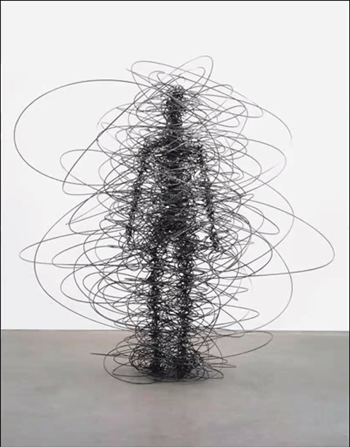
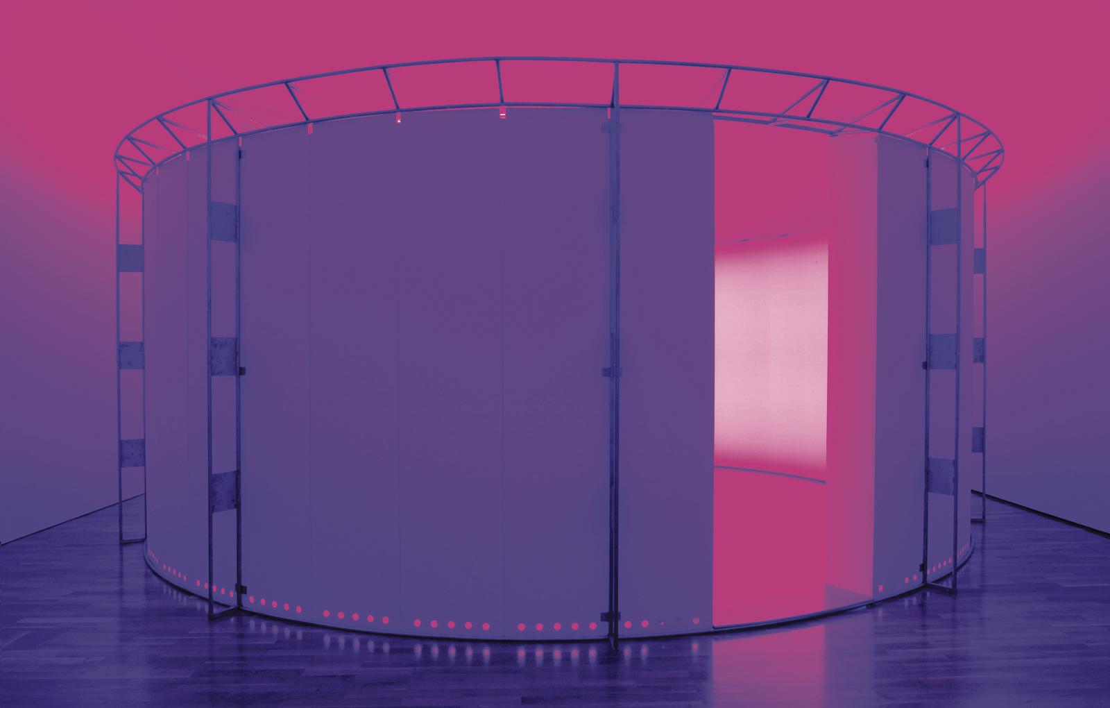
This is just a quick post to recommend Mary Attwood’s monthly one hour sessions on The Art of Seeing. I attended my first session in this series this week in which we looked closely at one sculpture by Antony Gormley. This was the sculpture – Feeling Material XIV (2005).
For the first 15 minutes we were invited to look slowly at the image of the sculpture, taking a mindfulness approach to observing the details. We did this in silence, with audio muted, and, if we wished, with video switched off. During this time of silence, Mary projected slides of the sculpture from different angles for us to observe. We were asked to engage imaginatively with the sculpture through reflection, writing and drawing or however we wished to respond, seeing round it and through it.
There were about 16 participants in the session who all had unique responses to this work, but it was also possible to detect common threads.
Mary then shared with us her knowledge of Gormley’s work including this writing by Gormley:
I particularly liked the first 15 minutes of silent observation in this session. Such a relief from constantly being required to speak and explain our thinking, although we were also invited to do this. So there was a very nice balance in this session which I found both stimulating and relaxing.
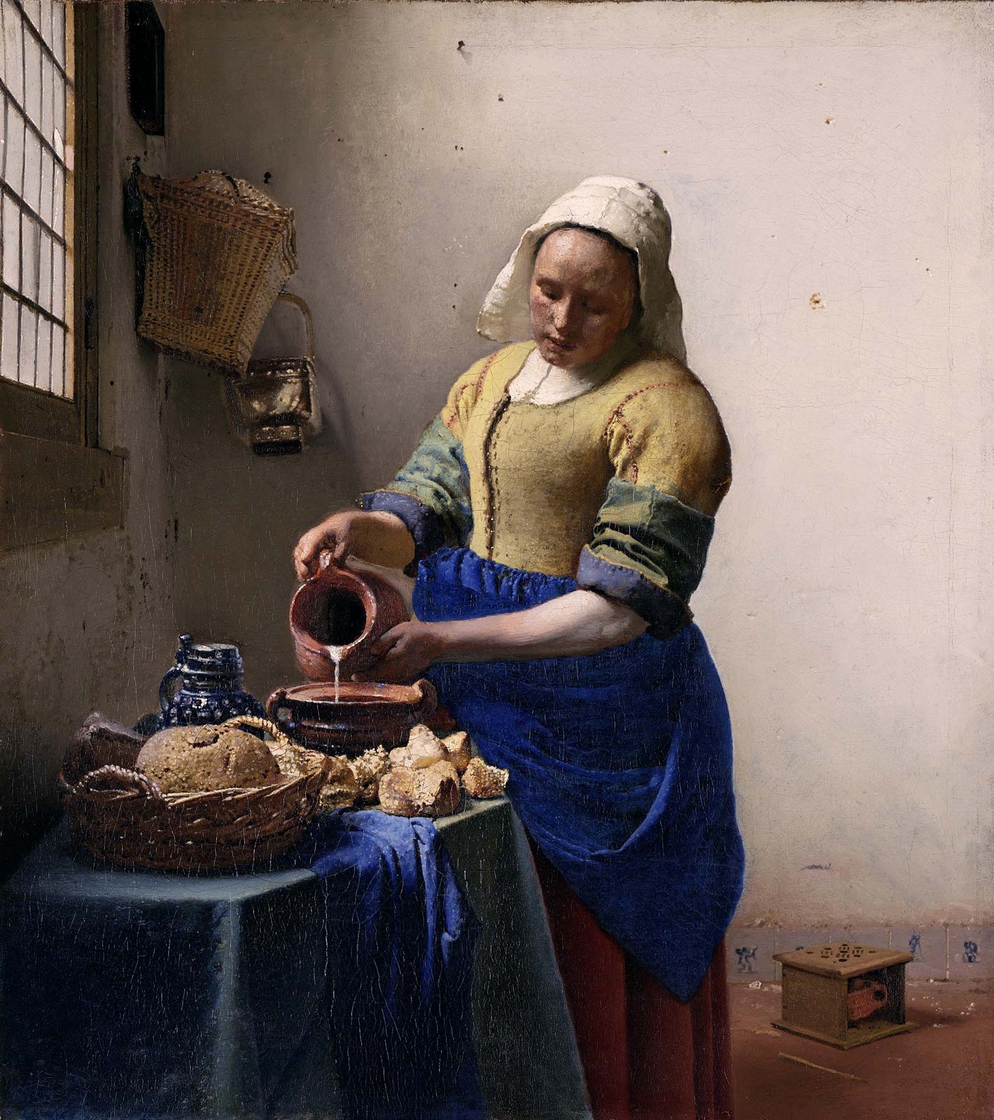
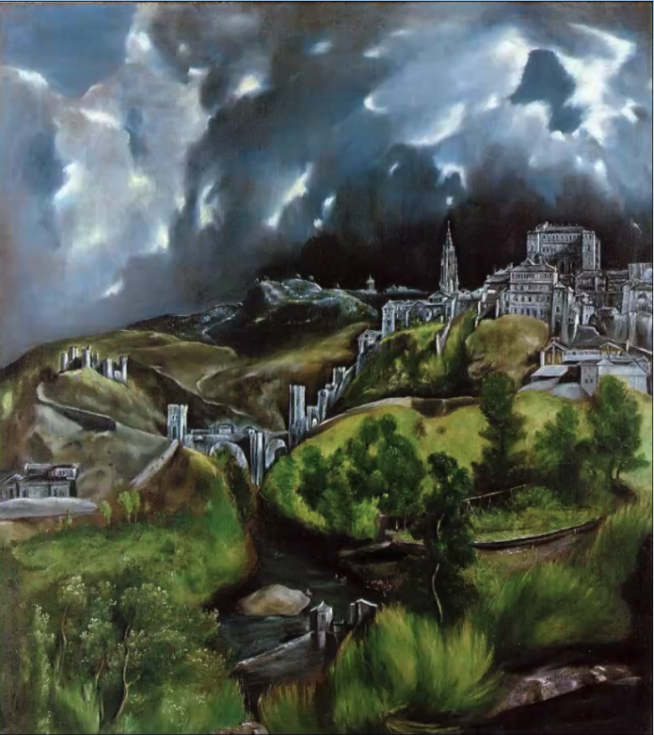
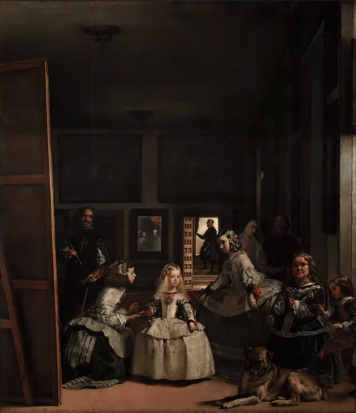
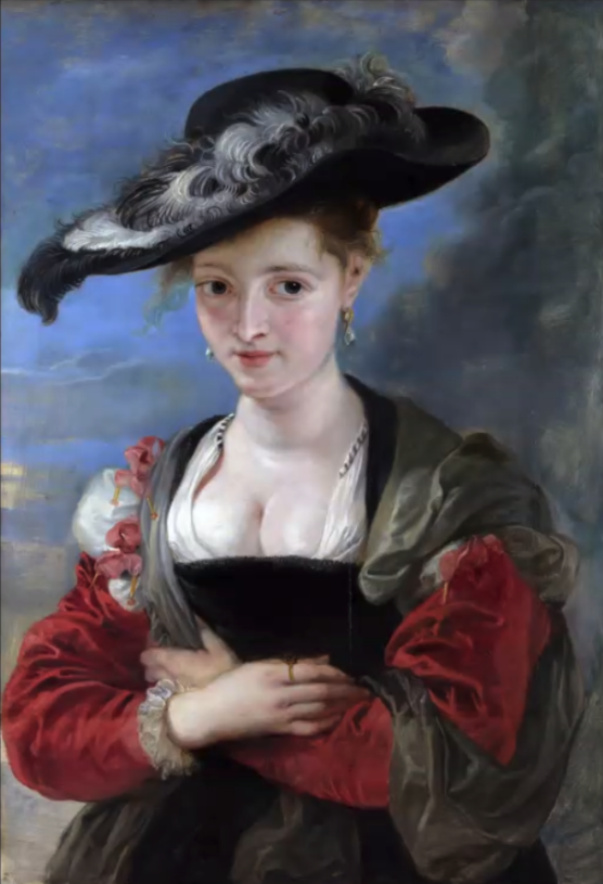
Last week I completed the fourth module of the National Gallery’s six week online course – Stories of Art: A Modular Introduction to Art History, 1600 -1700. The title of this module, hosted by Lucrezia Walker, was Baroque and the Dutch Golden Age. I really enjoyed this module, probably because of the amazing artists discussed – Bernini, Caravaggio, Artemisia Gentileschi, Rubens, Poussin, Velázquez, Rembrandt and Vermeer.
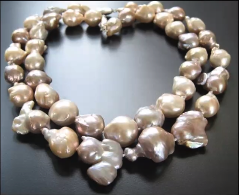
What I didn’t know before starting this module is that the word ‘baroque’ derives from the Portuguese ‘barroco’ word, which describes a large, irregularly shaped pearl. In relation to art, this was originally a derogatory term, suggesting excess, a flamboyant response to Renaissance classicism. Baroque was the leading style of this period.
As for previous modules, the course covered a wide range of artists, and showed hundreds of slides. There were 70 slides in Week 1 alone. For this post I will select one or two images from each week, to share a flavour of what the course was like.
Week 1: The power and the glory
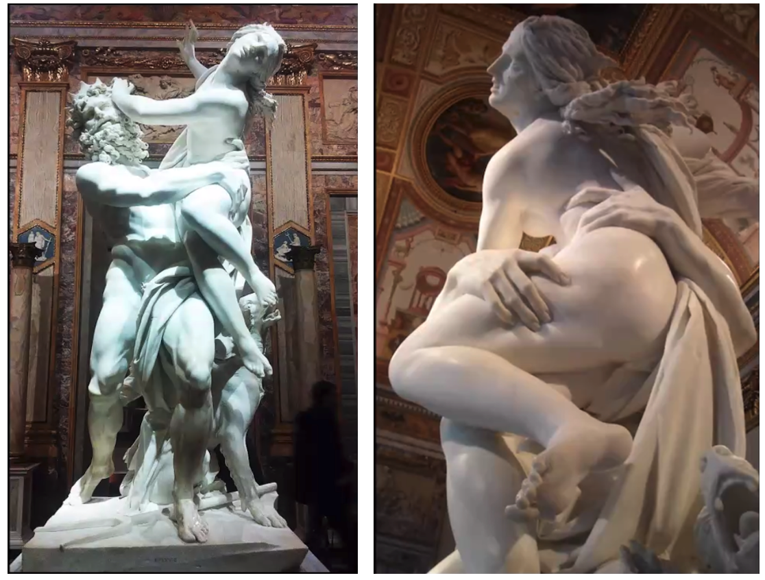
The focus in Week 1 was on the power and glory of 17th century Rome and in particular the wonderful sculptures of Gian Lorenzo Bernini, described by Lucrezia Walker, as the ‘big boy of Baroque’, an extraordinary tour de force. Bernini’s father was a sculptor, so Bernini began his learning at the age of eight, to ultimately become the Michelangelo of Baroque, a giant figure of many talents – sculptor, architect, painter, playwright, theatre designer and musician. He has been described as the ‘artistic dictator of Rome’. Bernini worked on St Peter’s Basilica for 40 years, and was so talented that he could make marble look like flesh, as you can see from this photo below of his sculpture of The Rape of Proserpina.
Not only did we get a great introduction to Bernini in the first half of Week 1, but we were also given a good look around the sites of Rome where his work features.
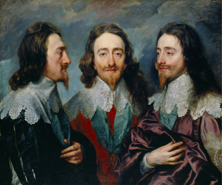
The second half of Week 1 was devoted to the art collection of King Charles 1, which was unprecedented in England. This collection was an indication of his power and glory. He collected work by Van Dyck, Titian, Rubens, Holbein, Bronzino and Mantegna.
Week 2: Caravaggio, the Catholic Reformation and the beginnings of Baroque
This week focussed on the first half of the 17th century in Rome, and in particular on the work of Caravaggio, in the first half of the session, and Artemisia Gentileschi in the second half. Both Caravaggio and Artemisia were hugely influential in the early 1600s, and then became less important, and were not rediscovered until the late 20th century (Caravaggio) and 21st century (Artemisia).
Caravaggio had a violent temperament, characterised by drinking, brawling, gambling and fighting. In 1606 he had to flee Rome after killing a man and spent the rest of his life travelling between Naples, Malta and Sicily. He was constantly in trouble, but he was hugely influential. His style was innovative and naturalistic, with dramatic contrast of light and dark. It formed a new kind of art for a new catholic church, and from about 1600 onwards, Caravaggio never wanted for patrons. Because Caravaggio produced a lot of work for churches, his work was widely viewed, more so than if he had painted solely for private collectors.
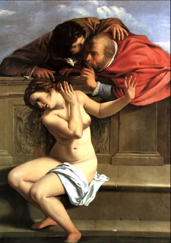
Artemisia was the most celebrated female painter of the 17th century. Her mother died when she was twelve and being the eldest child of a family of daughters she worked in her father’s studio, producing professional work by the age of 15. As a young woman, aged 17, Artemisia was raped by Agostino Tassi, an artist who visited her father’s studio. He was convicted of rape in 1612, but this event influenced not only Artemisia’s work, but also how her work was perceived. Nevertheless she became a successful court painter in Florence. Artemisia was strongly influenced by Caravaggio; her paintings were highly naturalistic.
Her painting, in 1610, of Susanna and the Elders (image above), which she painted at the age of 17, shows her distinctive style and was surely a premonition of what was to befall her within a year of painting it. But Artemisia has become a heroine of feminist art history. ‘I will show Your Illustrious Lordship what a woman can do,’ she wrote to a Sicilian patron. ‘You will find the spirit of Caesar in the soul of a woman.’
Week 3: The embarrassment of riches: Painting in the Dutch Republic (not baroque)
I found this the most stimulating all the six weeks. In preparation (as homework) we were asked to watch Rembrandt vs Vermeer on Intelligence Squared – https://youtu.be/cCQZnXz2Uss. This is a highly entertaining programme which I can recommend. Tim Marlow chairs a debate between Simon Schama and Tracy Chevalier over who is better, Rembrandt or Vermeer? This reminded me of a wonderful trip to the Rijksmuseum in Amsterdam in 2014, where I saw paintings by both Rembrandt and Vermeer.
At the beginning of this week’s session we were asked to vote on whether we preferred Rembrandt or Vermeer. The result of the poll was exactly 43% to each, with the remainder being ‘no preference’ responses. I voted for Rembrandt, which I probably wouldn’t have done if I hadn’t been to the Rijksmuseum, but as one participant said, it’s like comparing apples and pears.
Rembrandt was the 9th child of a wealthy miller and had a classical education. He was married twice (his wives feature in his paintings), lived to the age of 63, and was successful in his lifetime with a large studio. He produced a huge amount of work, including 80 self-portraits. He was a great painter of humanity.
Rembrandt, Portrait of Aechje Claesdr, 1634
Vermeer, a tavern owner and a dealer, as well as a painter, lived a shorter life, dying at the age of 42 . He was a much quieter artist than Rembrandt, painting simple images of glorious ordinariness. He produced relatively few paintings, working slowly and producing a couple of paintings a year. Vermeer painted scenes from everyday life, often a single figure in a room with light from the left. It is thought that he may have used a camera obscura, and he is known for lavish use of the expensive pigment lapis lazuli.
Vermeer, Woman pouring milk, c1658
Between 1640 and 1660, Amsterdam was the place to be, clean, ordered, with impressive land reclamation projects (God made the world, except for Holland, which the Dutch made!). There were more painters than butchers in Amsterdam and an explosion of different genres of painting, portraits, landscapes (townscapes, seascapes, urban landscapes, winter scenes) and still-life (lavish still-life and the vanitas still-life); ordinary people were buying art. This was the era of the rise of the dealer and the beginning of the art market. This was also a time when artists worked collaboratively on paintings. Some of the other painters introduced this week were Gerrit Berckheyde, Peter Saenredam (so different from Italian paintings of Catholic Church interiors ), Willem Kalf,Jan Janz Treck, Harmen Steenwyck,Adrien van Utrecht, Rachel Ruysch (whose paintings sold for more than those of Rembrandt‘s at the time), Willem van Aelst, Jacob van Walscappelle (still life), Aelbert Cuyp (landscape), Judith Leyster (portraits) and Pieter de Hooch.
Week 4: The art of Spain
Significant artists working in Spain in the 17th century included El Greco, Zurburan, Velázquez and Murillo. For the first half of this week’s session we looked at the work of all these artists. The second half of the session focussed on Diego Velázquez, whose work was discussed in more depth by Dr Gabriele Finaldi, Director of the National Gallery.
El Greco’s work took me by surprise. It seems so modern, and his influence can be seen in both cubism and expressionism. El Greco was a one off. He doesn’t seem to fit in any art school. His style was highly individual to the extent that people wondered whether he had a problem with his eyesight. His work is other worldly. He often elongated or over exaggerated his subject and used unusual colour effects. El Greco was born in Crete, but he travelled to Venice and Rome, before finally moving to Toledo, which was the capital of Spain until 1560. He was influenced by Titian, but particularly by Tintoretto.
El Greco, View of Toledo, 1596-1600
Velázquez was born into an educated literary family (a Portuguese mother and Spanish father) in Seville. but ultimately moved to Madrid where he spent his entire career in the service of King Philip IV, who was a sophisticated admirer of art. Velázquez was a famous painter at court, knighted by the King, with the Order of Santiago, and twice sent to Italy, which played an important role in shaping his art, where he came under the influence of Titian’s work. Las Meninas is thought to be Velázquez’ masterpiece.
Velázquez, Las Meninas, 1656
The painting doesn’t particularly appeal to me, but Dr Gabriele Finaldi, gave a very plausible explanation of why it has become such a revered work of art. It is a large group portrait which includes Velázquez himself with the cross of the Order of Santiago on his chest and the King’s daughter. The painting is a fascinating paradox of what is shown, and what isn’t; what is said and what isn’t; what is real and what is not; a story within a story; an image within an image. Las Meninas is a manifesto for painting. It shows that for Velázquez, painting is a speculative activity, not simply mechanical.
This week the focus was almost entirely on Rubens and Van Dyck, Rubens’ pupil. The first half of the session provided an introduction to both painters by Lucrezia Walker, and the second by Dr Chantal Brotherton-Ratcliffe, who explored the work and skill of both artists in more depth, showing us how to recognise the difference between these two artists by their brush strokes.
Rubens was described as the most successful artist who ever lived. He was extraordinarily important as a painter and was knighted by both Charles I of England and Philip IV of Spain. He was charming, and not only a painter, but also a polyglot, businessman and diplomat. Rubens had a very happy private life, marrying 16 year old Isabella Brandt at the age of 32, and after she died marrying another 16 year old, Hélène Fourment, at the age of 53. From Antwerp, Rubens visited Rome, where he saw the work of Leonardo, Michelangelo, Raphael and Caravaggio, who all influenced his work. As a painter Rubens was prolific. He had a studio of about 50 assistants and was therefore able to take on large commissions and deliver them quickly. On some paintings he collaborated with Jan Brueghel the Elder who painted the backgrounds. Rubens also painted landscapes but he was known more for his paintings of fulsome women.
He was strongly influenced by the work of Titian, and like Titian used thick paint on a heavily-laden brush, which gave his work a 3-dimensional sculptural feel. He loved strong colour, particularly vermillion. Later in his career, like Titian, he began to experiment with ‘less is more’, a softer, non-specific way of painting and used thinner paint.
Van Dyck was Rubens’ best pupil, very precocious and almost like a post-grad student, to the extent that it was sometimes difficult to tell their work apart. He was born to prosperous parents in Antwerp and by the age of 15 was already an accomplished artist. His father was a silk merchant, so Van Dyck was excited by fabrics, which can be seen in his paintings. Van Dyck spent most of his life working in Spain and England, where he became the leading court painter and was knighted by King Charles I, but he also visited Italy. Like Rubens he was heavily influenced by the work of Titian, and owned 19 Titians by the time he died. Van Dyck was known for his portraits.
Van Dyck died at the age of 41 by which time he was painting with thinner and thinner paint to the point where the ground paint showed through.
Week 6: Dreaming in Rome
In this final week the focus was on two important French artists working in Rome in the 17th century: Claude Lorrain (commonly known as just Claude) and Nicolas Poussin. Both these artists influenced future generations of painters. The influence of Poussin can be seen in the work of Benjamin West, David, Ingres, Delacroix, Cezanne and Picasso. The influence of Claude on Constable and particularly Turner is easily seen, to the extent that Turner, in his will, requested that the National Gallery hang two of his paintings next to two of Claude’s.
In the 17th century Rome was being revivified. The city was in ruins, but was full of vestiges of a great lost past, which artists found charming and poetic.
At this time the Cardinals were amassing art collections and there were many Papal commissions. This drew Poussin from Normandy to Rome in 1624 at the age of 30, when Rome was entering its full baroque period under Bernini. Poussin’s early work depicted mythological scenes and historical narratives, but later in his career he began to paint landscapes.
Poussin, Landscape with a Calm, 1651
Claude also finally ended up in Rome in 1628, where he too worked on landscapes, going out to paint with his friend Poussin. Both artists constructed their landscapes to lead the eye back through the paintings.
Claude, A Sea Port, 1639
Next week will see the start of Module 5 in this art history course, and will explore the 18th century (1700-1800), looking at the art of Fragonard, Watteau, David, Hogarth, Gainsborough, Stubbs and others.
A number of philosophers have tried to define art. Having just completed a six week online course (run by a local philosophy tutor Darren Harper) trying to answer the question, ‘But is it art?’, this seems a thankless task. Some philosophers have argued that art cannot be defined. There is simply too much variety. Having now completed the course, I agree.
Darren introduced us to a few theories which have been offered to solve this problem, but, from my perspective, none of them were satisfactory. Have we reached the stage where almost anything can be called art? Where do we draw the line?
Right at the beginning of the course we were each asked to provide our own definition of art. This was mine, although I have since decided, as mentioned above, that art cannot be defined in any way that could be called inclusive.
My initial definition: Art is anything that is perceived to be art, and is valued as art, by the artist or audience. A definition of art will always be subjective, and incomplete. Art is the result of a unique creative process, which involves skills and self-expression. It brings a fresh perspective on what it seeks to portray and evokes an emotional response.
It was interesting though to look at some of the theories and weigh them up against work that has been claimed to be art.
We started with Clive Bell’s Significant Form Theory. Bell claimed that the one quality which is the essence of art, is significant form. Significant form provokes aesthetic emotions (i.e. emotions different from everyday emotions, e.g. aesthetic rapture), in sensitive critics, the spectator, listener or reader, through the relations between parts of the art’s structure, e.g. the combination of colours and texture. A criticism of his theory was of its circularity. Significant form gives rise to aesthetic emotion, but aesthetic emotion can only be felt in the presence of significant form.
Next we discussed R.G. Collingwood’s Idealist Theory. Collingwood distinguished art from craft and contrasted genuine works of art with mere entertainment. Genuine art has no particular purpose and is non-physical. It is an idea or emotion in the artist’s mind. Critics considered this strange and the theory too narrow.
Then we considered Wittgenstein’s ‘Family Resemblances’. In considering communication, Wittgenstein believed that words have a family resemblance in their usage, a series of criss-cross relationships. Take for example the word ‘game’. We all know that tiddlywinks and rugby are games, and also that going for a walk is not a game, but what do tiddlywinks and rugby have in common? Wittgenstein compared this to the way members of a family resemble each other. He believed that all attempts at digging beneath the surface of language lead to unwarranted theorising and generalisation. He was anti-essentialist. From this it follows that there are no common denominators in art, there is no singular thing that defines art, but a range of properties, which similarly exist in the complex web of relationships and family resemblances. It is a mistake to look for any general definition of art.
Nevertheless people/philosophers keep on trying with this seemingly fruitless task. The Institutional Theory of art is a recent attempt as explained by contemporary philosopher George Dickie. According to this theory a defining characteristic of art is that it is an artefact which has been intentionally created or worked on by a human, the artist. More importantly the work of art has been given this status by a member of the art world – gallery owner, publisher, producer, artist, etc. Members of the art world change the artefact into a work of art by conferring this status on it. But what criteria does the art world use to determine this status?
So, given these theories and arguments, which of the following ten images would you say are works of art? (I have put the references for these images at the end of the post, so that they don’t influence your decision as you look through them).
(All the images can be enlarged by clicking on them)
My experience from the course is that the theories we covered are not a lot of help in determining which of the images above depict genuine works of art. More helpful to me were two comments made by one of the participants who is an artist and a retired art teacher. He said that when we talk about art we should remember that art can be good or bad. Also that there is a spectrum from fine art to craft. We have to be clear what we are talking about, and even then, it seems to me that one person’s good art will be another person’s bad art, and one person’s perception of art will be another’s of craft. But ultimately I think we probably improve in our judgements with experience , i.e. the more art we view the better we get at recognising Wittgenstein’s family resemblance, without having to define it.
Image References (The images above are numbered in columns, top to bottom, left to right)
Jonathan Birch, the host, started the discussion by posing the following questions: We know that nature inspires art, but can abstract science inspire art? What counts as beautiful science? What’s the significance of beauty in science? Is beauty a guide to truth?
In response Adrian Holme showed us some examples of where science has inspired art. The first example was Joseph Wright of Derby’s, An Experiment on a Bird in an Air Pump, 1768, where the process of science, the experiment, was the inspiration for the painting.
In this painting we see the fearsome power of science to destroy the objects it investigates. Air is being sucked from the glass chamber. The bird in the chamber is dying. The painting also shows that both art and science are public activities which require an audience.
Then, when Adrian showed us an image of The Shah Mosque in Isfahan, the discussion turned to the role of mathematics and in particular, geometry, in unpicking the relationship between art and science.
In the past, sculptors had to have a good understanding of mathematics and there was always a correlation between art history, science, mathematics and geometry. In the time of Leonardo da Vinci there was not a great conceptual divide between art and science. Both required knowledge and skill. In relation to this image, Adrian made the interesting comment that pattern runs deep into who we are.
The third image was of Olafur Eliasson’s 360o Room for All Colours 2002
This is an installation which consists of a circular space that surrounds visitors with slowly changing colours. It is a scientific experiment on our optical experience, but is also aesthetically pleasing. It plays with our perceptions of vision and is disorienting. Eliasson is interested in the ways in which people respond. Like Joseph Wright of Derby’s painting, this art works at the interplay between pleasure and discomfort. This installation raises the question of whether art can actually be science.
A member of the audience then raised the question of whether art would have the same appeal if it were created by machines, algorithmically. Adrian thought it might, although he thought that machines will create art better and quicker, but that the art would be banal. However, Milena Ivanova said that she had seen art created by artificial intelligence that she could not distinguish from art not created by machines. This raised the question of whether machines can be conscious and have their own subjective points of view or are they just mimicking humans? Milena pointed out that machines can create their own algorithms, but these questions related to artificial intelligence and consciousness were clearly straying away from the topic of the nature of beauty. Jonathan Birch, as host, then pulled the discussion back to the question of whether there is a definition of what art is and can a scientific experiment be an art work? Adrian Holme thought that some might be, if we think of scientific experiments as a performance.
The discussion up to this point was led mostly by Adrian, who drew on his experience as an artist to consider what science has done and can do for art. The second part of the discussion focussed on what art can do for science and whether science can be beautiful. These are ideas that Milena has recently been researching. At the beginning of this year she published a book with Steven French – The Aesthetics of Science. Beauty, Imagination and Understanding. She was very knowledgeable about this topic and had a number of interesting points to make, but she talked very fast and was sometimes difficult to follow. Hopefully there will be a recording of the discussion.
Here are some of the points I captured during this second part of the discussion.
Scientific phenomena can be beautiful, but what does it mean to know this? Scientists tell us to trust theories, without the evidence, because they are beautiful, and there is evidence that theories have been accepted on the basis of their beauty. Science can be motivated by the idea and search for beauty. There are aesthetic claims for theories of physics. How can we justify aesthetic judgements?
There seem to be some constant values which people use to make judgements about beauty and what is beautiful in science, e.g. simplicity, symmetry, elegance, naturalness, unity. These are some of the values that seem to be uniformly understood by different communities as related to beauty in science. But Milena noted that standards of beauty change over time, and sometimes there is resistance to this change, for example the beauty of the shape of an ellipse as opposed to a circle; this change occurred with changing understanding of the earth’s orbit round the sun. Here Milena referred to James McAllister’s work on Beauty and Revolution in Science. McAllister questioned how reasonable and rational can science be when its practitioners speak of ‘revolutions’ in their thinking and extol certain theories for their ‘beauty’. He studied the interconnection between empirical performance, beauty, and revolution.
Milena also referred to Sabine Hossenfelder, author of Lost in Math: How Beauty Leads Physics Astray, who has argued that an obsession with beauty has led physics astray. ‘Why should the laws of nature care what I find beautiful?’ Hossenfelder asks. ‘The more I try to understand my colleagues’ reliance on beauty, the less sense it makes to me.’ This suggests that science is not always about truth.
So is there a single concept of beauty for different realms? Do biologists have the same concept of beauty as physicists? Philosophers and scientists believe we should trust in beauty, but if science is not always about truth, what is the relationship of beauty to understanding and truth? Milena believes that beautiful ideas, simple and elegant, are easier to work with. Maybe it’s not necessary to obsess about truth.
The introductory material for this discussion included the following questions:
When presented with two equally good theories, scientists often prefer the more beautiful. Does this mean that more beautiful theories are also more likely to be true? That, as Keats wrote, beauty is truth, and truth beauty? Does this tell us anything about the nature of reality? And what does this mean for science and art and how they inform one another? We discuss the nature of beauty and reflect on the symbiotic relationship between art and science.
Whilst very enjoyable and interesting, it seemed to me that only the last two questions were discussed and even then it was impossible to come to a conclusion. A definition of beauty, art or truth remains open to question. But there seemed to be agreement that art and science influence each other. There does seem to be a symbiotic relationship between them and both aim for beauty whether or not we can articulate its nature.
I have sometimes thought, over the past eight months, that it might have been interesting, if I had thought about it at the start, to keep a diary during these exceptional times. But I didn’t – maybe an opportunity missed. Lockdown up till now has not been too bad for us. I consider myself to be very fortunate to have plenty of space in my home, and a large garden. We had a wonderful Spring and Summer, when I revelled in my close connection with my garden, and I didn’t find it at all difficult to find interesting discussions/lectures to follow online, and enjoyed the time I had for catching up on the reading that always seemed to be, prior to lockdown, on the back burner.
But today has not been a good day. We (here in the UK) are now in the second wave of Covid-19. My husband is a quadriplegic, so the first wave has simply merged with the second wave. We haven’t really been out of lockdown since March, apart from the very occasional, weather permitting, bike ride (my husband is a hand cyclist), and visits to doctors, dentists etc.
Today has not been a good day because it has been yet another day of rain and wind, made even worse because the clocks have changed, so the days are shorter, and it feels so much darker.
To be thoroughly self-indulgent, I thought I would record what a day in lockdown entails for me, in this personal, and therefore unique, context, at this particular time.
I got up at 6.00 am, hoping upon hope that the weather would somehow defeat the forecast and be good enough for the decorator to come and complete the painting of the outside of the house. Scaffolding went up in August so that we could have a much needed new roof (the first in more than 100 years), and it seems opportune to make good use of the scaffolding to have the outside of the house painted at the same time. But painting and wet weather don’t go together. The new roof was completed more than a month ago, but the painting is still weather dependent, and the scaffolding is still up, and the house is still dark as a result.
Given that my husband is a quadriplegic and needs 24/7 care, it takes a while to get up in our house, so it was 9.30 before getting up and breakfast was done. Clearly the decorator was not coming. It was throwing it down outside, but we are very dry inside, thanks to the new roof and chimneys.
I have found it very difficult to focus and settle to anything today. At 6.00 am I was on my computer following the BBC news – the terrible events in France, the drownings of migrants in the Channel, the further lockdowns and placing more areas in the UK in Tier 3 restrictions, and the ever anxiety-provoking American election. Please, please, please, Americans vote for Biden, although even then there is no guarantee that this would effect the change the world needs for future generations.
I have felt directionless all day. I started the day by answering emails, I am currently attending a course on ‘But is it art?’ which is considering philosophical theories of art and aesthetics. I replied to two emails from fellow participants. Are Egon Schiele’s self portraits art? What emotions do they evoke? Clive Bell’s theory of significant form tells us that art must evoke an emotional response. Should art evoke a feeling of awe, or a spiritual response? What does it say about me (or you) if it doesn’t, but does in everyone else in the course? Is there something universal about art or is it purely subjective? One of my correspondents felt really down today. Lockdown is particularly hard on those who live alone.
In the middle of this a district nurse arrived, complete with mask, visor, gloves, apron and hand sanitiser. Since the beginning of lockdown my husband has been ‘discovered’ by the system as being in particular need of ‘observation’ and care, being on the vulnerable end of the spectrum. This is when the NHS and care system in the UK are so impressive. Once they know about you, they can’t do enough. Today it was the delivery of a blow up mattress to prevent pressure sores. There have also been phone calls and emails today about various other aspects of care.
By lunchtime I knew that today was going to be a non-day for me, although my husband has been fully engaged marking assignments for the University and liaising on the phone with other markers and the health care team. Lunch is our main meal of the day, so that took up a bit of time, but after lunch I was back to feeling aimless.
I tried to read the next Chapter in Paulo Freire’s Pedagogy of Hope (Chapter 3). It was a toss up between Freire and Julian Jaynes’ The Origin of Consciousness in the Breakdown of the Bicameral Mind, but I decided on Freire. His is the next book to be discussed in the Philosophy of Education Network’s online reading group, but much as I appreciate Freire’s work, especially because, having lived in Brazil for seven years, it resonates on so many levels, I really cannot cope with paragraphs like this:
Although there can be no consciousness-raising (conscientização) without the unveiling, the revelation, of objective reality as the object of the cognition of the subjects involved in process of consciousness-raising, nevertheless that revelation—even granting that a new perception flow from the fact of a reality laying itself bare—is not yet enough to render the consciousness-raising authentic. Just as the gnoseological circle does not end with the step of the acquisition of existing knowledge, but proceeds to the phase of the creation of new knowledge, so neither may consciousness-raising come to a halt at the stage of the revelation of reality. Its authenticity is at hand only when the practice of the revelation of reality constitutes a dynamic and dialectical unity with the practice of transformation of reality.
Do people really speak like this? Did he really write like this, or is it a fault of the translation? Maybe other readers don’t find it a problem and it is my problem.
So I knew I didn’t have the necessary attention to apply to Freire today and fortunately I was distracted by a phone call from one of our sons, who is always entertaining. He was living with us from September 2019 to September of this year, but has necessarily moved on, and now we really miss him, so his call was a light in the day.
Then, after a bit of aimless wandering on the internet, I decided to do the ironing, which was only made bearable by listening to a Woman’s Hour podcast, which featured, among other things, discussion of Long Covid (which is one of the reasons I am doing everything I can to ensure that we are not infected), women and homelessness, and the US election (this is difficult to avoid at this time).
During this podcast, I decided to write this post, simply to remind me of how I am feeling at this time, but before settling down to write this post, I responded to a friend who has asked me to be a reader for his PhD (which is a joy for me) and is struggling to identify his contribution to knowledge. I well remember having the same struggle when I did my PhD. I am hoping that by sharing my experience I can be of some help to him, and his PhD subject is fascinating. I will learn a lot.
So that’s, more or less, my lockdown day, although it’s not quite over yet. Our daughter has said she is coming round with a chicken pie which she has baked for us. Our children have been a constant support during this lockdown, which reminds me that even on aimless days, there is a lot to be grateful for. And finally, another light in the day has been an image in my head of Jan van Eyck’s paintings. Last night I attended the second lecture in the National Gallery’s course – Stories of Art – which explores Renaissance Art from 1400 -1500 – From Botticelli to Bellini. The wonderful images from the course have stayed with me all day.